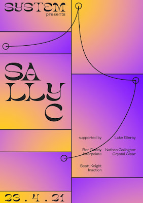
Taking my favourite previous outcome, adding gradients to every section of the grid. This was a 'trust the process' moment - as this in itself, looks very basic.
There was way too much happening at first, so I removed some of the gradients and the was much better - it allowed for breathing space around the text and was on a whole just much easier to digest.
Starting to play around with a more cohesive colour scheme - swapping the harsh white out for a softer off-white and changing the text to a cobalt blue and bright orange. I think that this was a good start, but knew that there was still way too much going on. It made me realise that the poster needs to be a lot more cohesive, and this will require minimal colours or a really strong combination.
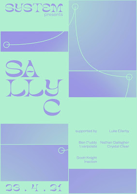
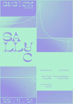
Finally, I started experimenting with gradient maps! This converted the whole image to just two colours but I like how the gradients are then cohesive but different at the same time. This was my first time playing around with Photoshop's pre-made colour combinations within gradient maps, so I definitely want to explore with some more colour combinations. For now though, I really like the outcomes! I think that they look cohesive and are starting to hit the right tone of voice.


No comments:
Post a Comment