Showing posts with label OUGD505 Research. Show all posts

Thursday, 29 April 2021

Guardian to be first national newspaper with biodegradable wrapping

The Guardian’s print edition will no longer be sold in plastic packaging, becoming the first national newspaper to switch to biodegradable wrapping

The Saturday edition of the paper contains a large number of supplements which are currently packaged in polythene to meet the demands of retailers and ensure they reach readers. 

From this weekend, the Weekend magazine, the Guide, Feast, and Review will instead be wrapped in a material based on potato starch, which readers are encouraged to compost or put in their food waste recycling bin. The packaging does not contain any genetically modified material. 

The change will increase production costs for the Guardian but is part of the newspaper’s plan to reduce plastic waste, following feedback from readers. The change will be phased in across the whole of the country over the coming months, starting this weekend for readers in London, Kent, Essex, Hertfordshire, Norfolk and Suffolk. 


It's a little late in the game for more research, but after sourcing out some packaging for my zine I came across this article about The Guardian's new compostable packaging. 

I'm kicking myself a little bit because if I had found out about this at an earlier stage in the process I would have really loved to look into this more sustainable option. It would also double up as a unique selling point, a page in the zine could be dedicated to describing how to plant it/ the things it could help grow etc. 

At this stage however, I don't feel that I have the time to order some new packaging. As well as this, it would be wasteful to disregard the plastic wallets that I've already purchased for the project. Alas, it's something to think about for the future. 

Monday, 26 April 2021

More one colour overprint inspo


I now have all of my paper and I've scanned them in and begun to digitally experiment with different coloured inks. I was really excited to get into the studio today and do my print tests but unfortunately all of the studios are being used until 4.30! I've been using the day to instead catch up with blogs and I'll start my design boards. In the meantime, my friend lent me this piece of inspiration - an events catalogue from Hyde Park Picture House. The risographed publication includes around 10 sheets of coloured paper that have all been printed on in different coloured inks - and the colour combinations are amazing. I really want to achieve that pastel/ muted style of print within my own work.  

My digital colour experiments:


These are utilising the A4 off-cuts from the paper stock I bought which I'm going to use to find out which colour combination I like the most. 

Thursday, 15 April 2021

Ephemera


Surprisingly I've come across something that's been a very big inspiration to me for a long time but I haven't know that there was a name for it. I was thinking about how my end product is a collection of things: poster, zine, coaster, bookmark, sticker sheet and was wondering if there was a name for this other than a 'collection'. 

I remembered Dom saying a word to do with multiple pieces of printed matter but I couldn't remember what it was so I started digging and realised it was Ephemera! After looking at the word description I realised that this was the name for all of the 'random bits' that I've been inspired by for years. 

I started collecting random bits of printed matter a few years ago: bus tickets, flyers, posters, tea bag labels etc etc because i was inspired by all the random collections that I would see online. Anything that I found that 'looked nice' I would add to my collection, but I've always been a big fan of all the vintage items I would see on Pinterest too. I've realised that when you search up ephemera a lot of it is quite naff, old maps and sheet music etc. but I'm inspired by the things that have really interesting graphic qualities. 

I think it's really interesting that a lot of ephemera is designed so beautifully but is "only meant to last one day" or "one use" - with Glad Print, I'm kind of going against that grain by designing things that have double uses, and can be used time and time again.  

Examples of ephemera that I've saved for inspiration previously:


I've always been really inspired by the 'look' of ephemera without knowing what it was. The typesetting has that blocky, unique feel to it and is so bold. It's always been the type and the grids that interest me. 


Examples of art that I've been inspired by that has an ephemera feel to it:


Robert Rauschenberg 


R. B Kitaj


Micosch Holland

I've always kept my interest for fine art and looking back, the kind of art that i'm into definitely has an ephemera feel to it. I've been obsessed with Robert Rauschenberg for a while now and wrote an essay about him for A Level Fine Art. I wrote about how he would make art out of the scattered, unwanted waste of New York - so it's no wonder why his art feels like ephemera when it's literally made out of the stuff. Similarly in the image by Holland, you can see the use of ripped up pages from books of his time, an image of a chair from a furniture catalogue that he probably had lying around. 

Not too sure what the point in this blog post was but I just got excited about my new design discovery and could probably write an entire essay about ephemera in art and design. To conjure up some sort of relevance to Glad Print - don't think that my designs from this stage will suddenly start looking like vintage bus tickets, but I think its more about the idea that's relevant.  Designers would put a lot more effort into something that was only supposed to be used once, accidentally making things look a lot more interesting than they really were? I think that's quite interesting. 

Good Press inspo update


nice example of range


Little a5 leaflet on their printing service Sunday's. Love the two colour riso and naive illustration.


Interesting folded information sheet about what they do. I love the random whimsy purple texture in the background and the contrast between the brown text. Also love the fold in the middle - very newspaper-esque. 


I'm presuming the wrapping is printed in store too - I love how they've kept the white bleed, it keeps the feel quite hand done and personal. 

My order from Good Press arrived and I'm really happy and inspired! I think that the package as a whole is an amazing example of range and I was really impressed with how cohesive every piece of printed matter was. 

As well as what I ordered, the package included The Paper which is printed in store, two nicely printed leaflets about their services, and an a3 poster, all wrapped in paper with a design printed in store. Even the little bag that the bookmark came in was stamped with a nice little personal touch.

This is really something to aspire too - I want the zine that I publish to have this same attention to detail and cohesiveness throughout. Each element is different but the similar hues and textures are what tie them all together, making the branding feel familiar and apparent. 

Some things that the order have got me thinking about are:

- Colour combinations
- How I can extend my range through printed matter
- Printing process, I don't have access to a riso printer and the whole point of the project is that I can physically produce it myself, so I really want to start printing off colour copies at uni to see what the outcome is like

Friday, 9 April 2021

The Paper by GoodPress


I've recently found some inspiration in a zine that my friend lent me called 'The Paper' by GoodPress. The Paper is a free monthly submission based newsletter by Glasgow bookshop GoodPress. It's printed onto a thick newsprint using risograph, bound with two staples and folded down the middle. 

I was initially really inspired by the physicality of the zine, I don't know if it's intentional but the way that its folded in the middle really resembles a traditional newspaper, despite it being only A4 in size. The actual process of unfolding it and opening it up feels really familiar - and instantly recognisable. 

GoodPress give a copy of The Paper away for free with every order, so it's got similar ideas behind my own project - a non-profit, printed matter kind of thing. Looking at some scans of old editions on their website, I can see that they've experimented in the past with thinner newsprint, different binds, different colour ways etc. and I just got really inspired for my own project. For Glad Print, I have the opportunity to do something similar and play around with colour and form - which is really exciting. 

Also, looking through their website I got really inspired and ended up ordering two books: The Form of the Book Book and The Natural Enemies of Books: A Messy History of Women in Printing and Typography. I'm really excited to receive these and start reading them because I've obviously gotten into print so much more this year and really want to start expanding my knowledge on that specific subject more. 

Another cool thing that GoodPress do is their bookmarks. They recognised that due to lockdown we all might be reading a lot more than usual, so collaborated with some artists and illustrators to produce some bookmarks and sell them for charity! This kind of links to my bookmark format idea, I really want some elements of my articles/ zines to be re-usable in calming, self-care ways. I think bookmarks are a good way of doing that.

Saturday, 27 March 2021

And Now For The Good News by Ruby Wax

When I carried out my questionnaire and asked people for examples of where they find positive news, one person wrote that they were currently reading And Now For The Good News by Ruby Wax. For my research, I ordered a copy and I've been reading it alongside making work. My initial intention was that it would give me some content for whatever I made, however, it's not really written in an appropriate way for that purpose. It's more of a written insight into Ruby's travels around in search for some positivity and touches on society and mental health quite a lot. Despite, it's still been really useful in prompting me to think about some particular things: 


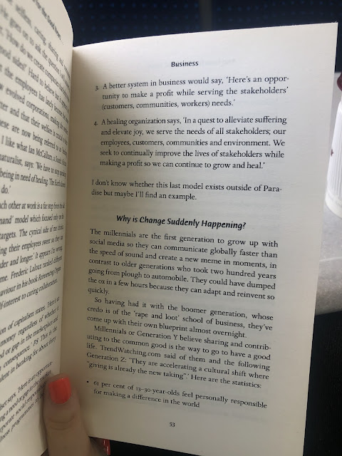
Within the business section of the book, Ruby discusses 'conscious consumerism': a new type of business model and way of thinking that new companies are taking on. It involves the three elements of conscious consumerism: purpose, mission, and vision. Even though Glad Print isn't a company or a business, it got me thinking about my own responses to this 'hierarchy of principles'. Obviously, if Glad Print were to grow and hypothetically become a proper bi-monthly edition sort of thing, it would follow conscious consumerism, as this aligns with the intentions of the brand. 

Purpose, refereeing to the difference you want to make in the world. The purpose of Glad Print is to randomly distribute positive information, surprising people with optimistic news stories to brighten their day. A further purpose is to interrupt the way that we currently interact with the current news media outlets. How can we approach the distribution of information differently and in a more considered way? One that looks out for us instead of trying to scare us? 

Mission, the way in which you will achieve your purpose. The way in which I'm aiming to achieve my purpose is to actually physically produce a decent amount of 'zine packs' myself and distribute them accordingly. I want to put them in places where people will find them and them pass them on. I'm a little bit worried about putting them on trains/ buses because I think with the current pandemic they would simply get thrown away. Maybe I could order some of those little single wipes and stick them to the outside packaging? I'm not really sure. 

Vision, how you see the world once your purpose has been achieved. I think that my vision is a far-fetched one, as pessimistically I can't see the way in which we consume news as a society changing radically anytime soon. But ideally, I would love for news to be distributed to us a little bit kinder. With the rise of smartphones, graphic imagery is shared on the six o clock news that people watch as a family, a long with some pretty horrific language/ stories. I understand that it's so important that this information be shared, but I think that we've gotten into a monotonous routine where we only share the negative without a second thought. 

(For example, when I was in high school I was forced to listen to a phone recording of a victim of 9/11. At the time, it was completely unrelated to whatever we were studying in English Lit, but my teacher felt it appropriate to traumatise a group of 12 year olds by making them listen to the recording. I feel like the premise is similar, there are ways to inform and educate that are more appropriate than fear-mongering and scaring.) 

We're constantly being exposed to negativity everyday on the news. I wish that the same amount of effort was put into uplifting people, encouraging them, and reminding them of what's good in the world. 


Above: some good examples of positive change that I could try and find articles on to use as content. 

Type Inspiration: Cheltenham Bold and Newsagents


I follow NY Times on Instagram and I never noticed how nice their graphics are till now, as I'm obviously paying much more attention to things like this in hopes of inspiration.

For their posts and stories they use a simple white/ black/ grey colour scheme along with the use of images with text overlaid. The monotone colour scheme is obviously inspired by traditional printed newspapers and suits the tone of the brand: professional, informative. 

I was mainly inspired by the typeface that they use. I found it it was a mixture of Cheltenham Bold and Cheltenham Bold Italic (along with Helvetica for body text and information). As time has gone on throughout my time at uni, I've been gradually getting more and more interested in typography - which is a good thing. I can't really explain why but I felt that this typeface had a really appropriate feeling to it. Probably because the designers at NY Times did their research and picked Cheltenham because it has some sort of interesting connection to printed news. 

I'm definitely going to have a go with designing with it, I'm excited to see it paired with the journalistic style of illustration as I think that that will feel really connected and appropriate.

While I was thinking about type I started thinking about type that surrounds the news that also isn't so obvious. I thought about local corner shops and how the signage is always quite quirky and unique, often retro with interesting colours. This isn't a new idea within the project, as I have thought about designing for corner shop signage previously. Taking direct inspiration from the type used would be quite an interesting route.


type: Cooper Black. Red and blue colour way with shadow effect. 


Bold sans serif type in red and blue colourway


Serif font, kind of similar to Windsor, paired with italic serif font, script-like. Red and blue colour way again. 


similar (more modern) type: Beni Bold. Again, a red and blue colour way, a theme? 


type: Impact MT


type: Novarese Std Ultra


https://www.bbc.com/culture/article/20200325-a-cultural-history-of-the-beloved-corner-shop


I've got a lot of things to experiment with here, which is a good thing. I also had a quick look at the above article which discussed the history of our corner shops. Although it wasn't very helpful, it provided the above image of hand-painted shop advertising which could be an interesting visual to experiment with. It's a little bit far-removed, but it could work?


I remembered that shop fronts and signage have always been something I've been inspired by. The above image I took a while ago and added to my random inspiration folder. Although it's a shut down fish shop - I feel like the premise is still the same. There's something really appealing and almost comforting about these 'retro' signs.  

Things to experiment with: 

- Cheltenham typeface
- Red and blue colour combination
- Shadow effect
- Bold sans serif

Module Evaluation

This module has been really positive for me. I'm so glad that I chose the issue that I did, because I felt passionate and motivated the ...