Showing posts with label OUGD503. Show all posts
Showing posts with label OUGD503. Show all posts
Sunday, 21 February 2021
Thursday, 18 February 2021


Wednesday, 17 February 2021


Saturday, 13 February 2021
Social media development so far

Initially putting together simple and effective profile picture ideas.


Further initial ideas for IG posts - some simple, some with a stronger link to the poster, use of grids/ shape/ illustrations etc.

[there is a video here]
After putting together simple layouts for the profile picture aspect, I had the idea that I wanted the logo to spin. I've made small/ simple animation using Photoshop Timeline before, and tried to do it here - but it came out unsuccessful. To carry out this idea correctly I would have to use proper editing software, possible After Effects? At this point in the module - I simply don't have time to do that as I'm not very familiar with that software.


When I started putting together layouts for IG posts I was using the same grids that I used for the poster. I feel like these were also not working (the first two with grey backgrounds). They're not the worst, but the super detailed style with complex grids and small elements simply doesn't feel right for the IG format. It needs to be easily consumable, quick to understand and take in.
With this in mind, I started to blow up the type and essentially make it massive in comparison to what it was (the last two images). Combined with eye-catching gradient backgrounds rather than the dark grey - this felt a lot more appropriate. I'm aiming to produce 6 to 9 IG posts and plan to go ahead with this more simplistic style.
New Time Plan

Luckily I've been given an extension for this module, which I'm grateful for as it means instead of rushing to get the work done for Wednesday and handing in something that I'm not happy with, I have a week longer to perfect my work and hand in something I'm proud of. I've come home from Leeds for personal reasons and hopefully can focus a lot better on my work while not putting too much pressure on myself. In order to do so I've planned the next week - I'm not going to stress myself out trying to follow a too-regimented plan but have loosely outlined what it is I need to to, and when I have time to do it. I'm really grateful for this extra week as it means I can produce more of the deliverables that I was hoping to. These are:
Branding/ logo (which I've already done, I just need to outline in a client presentation highlighting colour scheme, type, etc.)
A poster for the event (which I've also done, but want to tweak slightly as I'm not 100% happy with it.)
A series of six IG posts (which I've started to develop)
A Facebook header
A SoundCloud filter graphic (this will take on a similar format to the IG posts, so shouldn't be too difficult).
Tuesday, 9 February 2021
Final Poster Design

Combining all my refined elements - circuit symbols, equipment shapes, graphic notation, logo, text, images.

Showing how these relate to the grid.


Different iterations - moving around the graphic notation until it works harmoniously with the rest of the design.

Taking my chosen colours that relate to my research on emotion and experimenting with all possible gradient combinations.


Adding these gradients to the design to achieve the final poster.
What to do now:
I've contacted Luke to ask the specifics about the social media content that I need to produce. He mentioned a Facebook cover photo, but I need to be sure that he doesn't also want an Instagram page. As soon as he lets me know the details I'll be ready to insert the brand identity that I've created into a different format, whether it be a cover photo or an Instagram post etc. and I also need more information on the mix tape filter graphic.
In terms of posters, the only one that Luke needs right now is the one above for this specific event. I mentioned doing some simply for his company to advertise, but he hasn't organised this yet. So for now, I think it's best to focus on the social media advertising that he definitely can do.
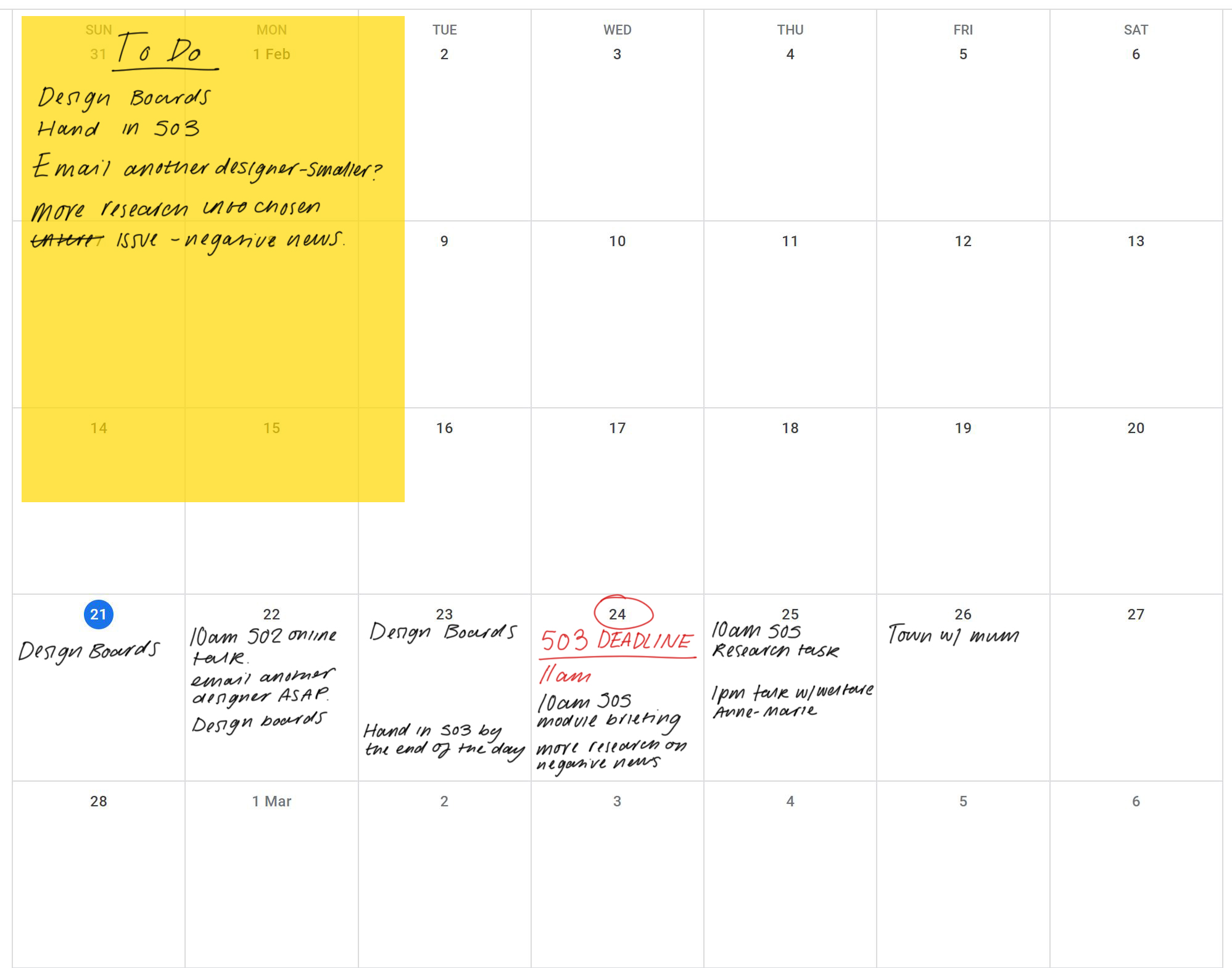
Monday, 1 February 2021
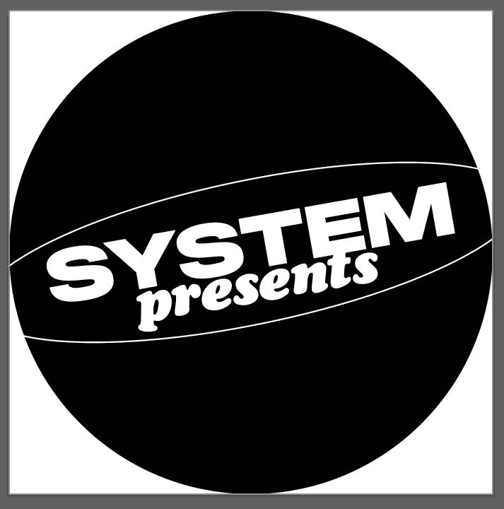
Logo development


The key points from my feedback from both peers and the client were that the logo needed to have more personality, and definitely a different typeface. I started working with Juniper - a display serif, kind of 70s in style. In some cases it worked, bottom right for example, but it didn't feel like the right tone of voice for the brand. it was too 'retro'.
When I spoke with the client he spoke about how much he loved the typeface I used in my initial poster - Franklin Gothic Outlined. I tried to work with that too, but with the half circle it just reminded me of the Blue Note Records logo too much, although it was still an improvement, a sans-serif definitely fit the tone better.
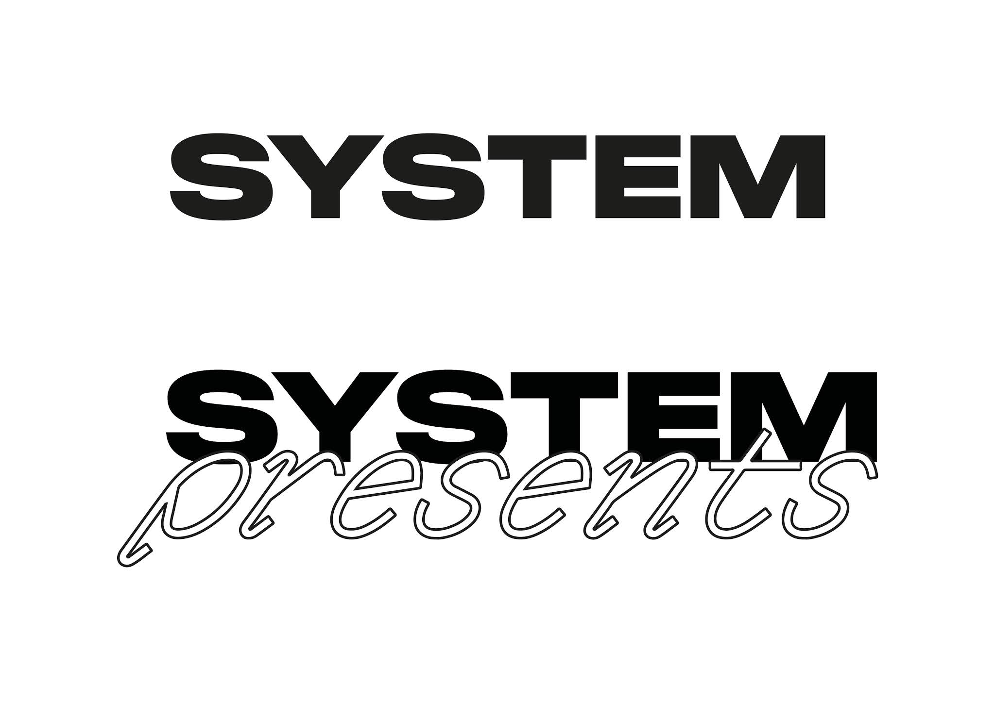


As I was struggling I decided to start from scratch. I used Monument Extended Bold for the main type - and this gave off an appropriate 90s feel due to it's chunkiness and extended letterforms. As the client was asking for 'more personality' I decided I would find a playful script font for the sub text 'presents' to accompany 'System'. I found G2 Ciao - a funky handwritten style serif. I was really happy with the combination of typefaces and thought they paired well together.
I asked for some feedback from Lucy who's given my insightful feedback previously, and she gave me the thumbs up. She said that what I had come up with had a very '90s rave flyer' feel to it, especially due to the hand-rendered style of the script font. With some added texture, she thought that it was there! However, I confidently shared it with the client and he wasn't too keen. He loved the typeface that I used for System and felt that it was 'spot on for the brand'. In terms of the 'presents' text though, he 'wasn't 100%'. He didn't like the type and also didn't like the way that it overlapped, so I experimented some more:

This was a short stint using the typeface Nostra, an extremely modern/ futuristic style script font. I quickly experimented with it and realised that it was completely unreadable, and as the logo will be quite small on the poster - it was unusable.

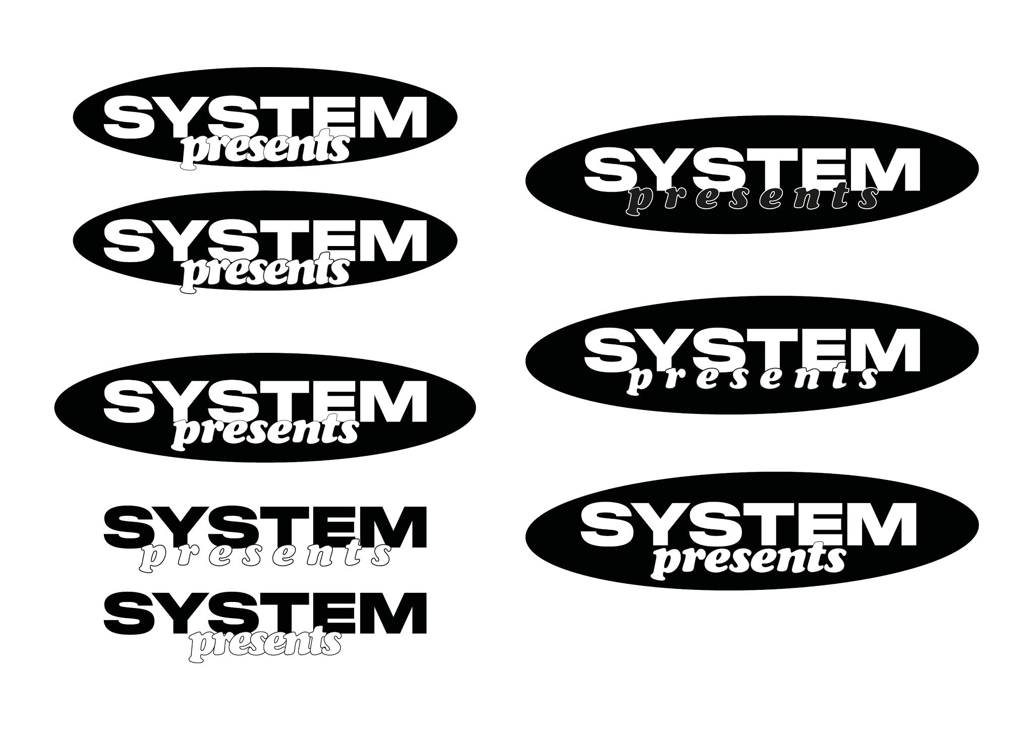

I went back to G2 Ciao for a short while, but what was more influential was my experimentation with a different rounded shape. I swapped out the half circle for an ellipse and this immediately felt more personal. With no sharp corners, it felt rounded and friendly and right. I then decided to take this idea further into the type, and swapped out G2 Ciao for Cooper Black Italic. This seemed to work, I would go as far as saying that Cooper Black is the friendliest typeface out there - so it felt appropriate. There was also minimal overlapping - so I thought that this would please the client.

I sent this new logo to Luke and he approved it - he was very happy! He actually gave me the idea to create an outlined version as he said 'could you make it more liney?'. I tried it but realised that this lost a lot of the impact and mocked it up on one of my previous posters to show him. He realised and agreed that the first version was more impactful - but I agreed to experiment with the outlined version further and try and make it useable.
Subscribe to:
Posts (Atom)
-
 - Attempting to continue with current theme by developing a anthropomorphised fruit character - This was interesting in theory...
