Showing posts with label OUGD501. Show all posts

Saturday, 2 January 2021

Project Statement

 The practical work within this module is a direct result of the research and findings within my essay 'How are graphic designers responding to a need for more sustainability within the print industry?'. Within the essay my findings revealed that graphic designers have a large part to play in the print industry's negative impact on the environment and hence forth have a responsibility to work with a more holistic sustainable approach. Furthermore, I explored a small selection of ways that designers are doing this - highlighting that it can be done. 

Sustainability is discussed widely across the globe - however, when it comes to there being information regarding graphic designers specifically and what they can do to make changes in their daily practises, it is lacking. Hence, my practical project - producing a publication for graphic designers about what graphic designers can do to help the issue. Even further, the publication in itself is an example artefact of a number of sustainable ways of working and processes. 

Looking back at this module, I feel very proud that I managed to push myself out of my comfort zone - even if just slightly. Instead of just researching and analysing - I decided to reach out to other designers, and it paid off massively! Having a back and forth email discussion with Luigi Gorlero was an amazing step forward, and makes me feel so much more confident about doing it in the future. Not receiving any sort of response from the designer of It's Freezing In LA! was humbling and reminded me that it's better to reach out to more people as you're more likely to receive a response that way. 

 Furthermore, due to the pandemic a lot of physical resources weren't available - but within this module I think I used more resources than any other before. Whilst I was at uni before going home for Christmas I made sure to use the facilities as much as I possibly could. Every single experiment that I did I ensured to do a print a test so that I could see how it worked physically, and was devastated when realising I didn't have a printer at home so could no longer do this as it was such a helpful resource. However, I didn't stop there. I continued to reach out to friends asking for advice, as well as ordering sample paper stocks to experiment with at home - even though I didn't have a printer. Hence, this module has made me realise how much I enjoy working physically and how important it is to me.  I am so disappointed that I won't be able to print my final publication and hand it in now that I can't go back to uni - but aim to do so when I can. 

In terms of achieving my potential within this module, I can see where I pushed myself harder and forced myself to be more ambitious. The discussion with Luigi Gorlero gave me the confidence to do this. At the start of the module I was aiming to produce only a visual essay, however after speaking with Luigi I became more determined to achieve something better. I am proud of myself for doing so, however even now I think that I still could have done more. It perhaps would not be achievable within the time limit, but I would have loved to go further and focus on the branding for the magazine more. I could have created guidelines, social media content etc. and I would love to even design a second edition of the magazine!

Due to the pandemic I found that I didn't receive a lot feedback for this module. The only feedback I received for my publication was from crits organised with friends - and I was so grateful for it. Some of the crits we held were pivotal in changing the direction of my publication and making it better. For example the dimensions and seeded paper stock would not be the same if it were not for this feedback. 

Tuesday, 29 December 2020

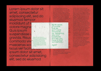
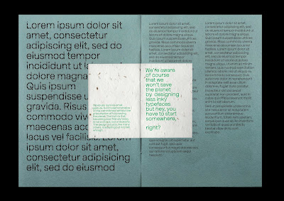
Final Mock up


When tweaking the design for my final outcome, I realised that there was actually an uneven amount of pages. I saw this as a good thing, as one of the aims behind my design is 'less is more' so being forced to take out another page and condense some information was a good and relevant challenge.

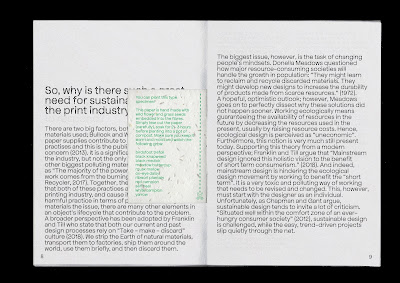
I'm really happy with the stripped back layout I ended up with. I think that the typeface and paper stock give the publication some character while the layout adds some seriousness. All together, I think that the tone of voice is clear. I really wish that I could see the whole thing printed, I keep imagining how future editions would look with different coloured stock for the front, back cover!

Chosen Paper Stock


My paper from G F Smith finally arrived which was so helpful in actually choosing what stock I will use for my final product! Actually being able to see and feel the paper in real life made a huge difference in the decision. 

I had already decided on the stock for the type specimen - the seeded paper. I wanted to make sure that the other two stock I used complemented this choice as best they could in order to make the whole publication as cohesive as possible (especially as it is such a small document with not many pages). 

For the inner pages I went with Neenah Environment PC100 White 118 GSM. This paper is lovely - I wanted to avoid shiny classic-magazine-style paper as this doesn't feel or look sustainable. This paper has a very very subtle shine in the light and is soft to touch. 

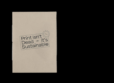
For my front and back cover I went with Gmund Bier Weizen 135GSM. After my previous mockup I thought that I would choose something more colourful, however, this paper stock is beautiful in it's subtlety. It's qualities mirror the seeded paper so well that that it brings the publication together as a whole. It is a warm off-white with brown speckles. 

I'm finding it really difficult to show off how well the paper works together digitally. I downloaded the digital versions from G F Smith but their scans don't seem to do them justice. For my digital mock up of my final publication I'm going to try my best to digitally edit them to reflect the real life effect that they have. 

Monday, 28 December 2020

First Final Design


- Using the paper stock Gmund Bier Lager (on this particular mock up it looks really dark?) for the front/ back cover. I really like the effect of having a different coloured front and back cover - I also like the way that the inner covers have been utilised as this perpetuates the 'use as much as you can' idea. However, I'm not happy with the colour of paper stock. I feel that it looks un-inviting and bland, as well as like a manila envelope. The tone of voice is informative and professional, however I feel that this stock is too cold and boring. 

- I'm really happy with the layout of information within the design. I took a long time to lay out each page and kern the text. There was A LOT more text to sort out than I realised but I think that the end result is successful. 

Monday, 21 December 2020

Logo/ Front Cover


When designing the front cover/ logo for the publication. I wanted to create some contrast to the inner pages. My plan is to lay the text out in a way that takes up as much space on the page as possible in order to have minimum waste. I thought that on the front cover, however, that there should be a reverse approach in order to create some contrast. By just having the logo on the front cover, it creates some ambiguity - making the reader open the publication up to read more. I think that this approach is successful - I feel that it makes an impact while remaining professional and interesting. 

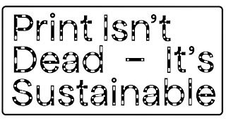
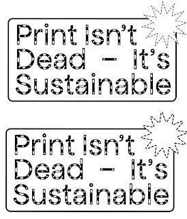
In terms of the logo - I went back to the one I had designed previously but made some tweaks. I adjusted the kerning and leading but most importantly switched the stroke to a dotted line to mimic the shapes used within the typeface Apfel Brukt. I really liked this approach as it visually makes a strong connection to the typeface so I will use it as a motif throughout the publication.

Paper Stock


Neenah Environment Grocer Kraft


Neenah Environment Concrete


Extract Mustard


Gmund Bier Ale


Extract Ember


Extract Coral


Gmund Bier Lager


Extract Cactus


Gmund Bier Pils


Extract Aqua


Extract Moon


Neenah Environment PC100 White


Three favourites: 
Extract Aqua 
Gmund Bier Pils
Gmund Bier Lager

Thinking about how my mini type specimen would look against my bigger publication, I began to question what paper stock I will be using. The paper samples that I ordered from G F Smith still haven't arrived and with time pressing on I can't wait for them to make a decision. Instead, I decided to download all of the digital samples of the sustainable stocks to mock them up. 

I really enjoyed seeing the array of colours that are available - especially as they are all sustainably made! I felt that my three chosen favourites complement the off-white tone of the seeded paper as well as the green riso ink well. They also create the most legibility when paired with the typeface Apfel Brukt. (Colours of the paper stock may appear darker due to blending modes - this needs to be amended in the future).

However - after pondering the many different colours of stock I realised an issue. I plan on having images printed in my magazine. The printing process I'm using is Risograph so the images will be reduced to a maximum of four colour layers - but I still need to think about how these will look against the paper. Perhaps I will use Neenah Environment PC100 White for the inner pages of the magazine and a coloured stock for the front/ back pages? I think that this could add some nice diversity to the publication.

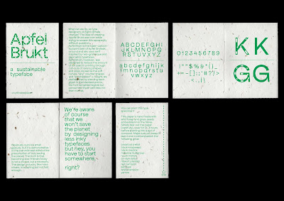
Mini type specimen


Feedback: could halftone the solid letters to keep in theme with less-ink? To go even further I could have dotted lines instead of solid. 

I really like the outcome of this mini type specimen. I decided to go without the cartoon elements as I don't think that they worked with the tone of voice I was trying to achieve of felt justified. Instead, I went with a minimal, simple layout that really lets the typeface and the paper stock do all of the talking. I think that this will make a perfect small edition to the bigger publication. It adds some texture, colour, and interactivity. 

Module Evaluation

This module has been really positive for me. I'm so glad that I chose the issue that I did, because I felt passionate and motivated the ...