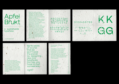
Feedback: could halftone the solid letters to keep in theme with less-ink? To go even further I could have dotted lines instead of solid.
I really like the outcome of this mini type specimen. I decided to go without the cartoon elements as I don't think that they worked with the tone of voice I was trying to achieve of felt justified. Instead, I went with a minimal, simple layout that really lets the typeface and the paper stock do all of the talking. I think that this will make a perfect small edition to the bigger publication. It adds some texture, colour, and interactivity.


No comments:
Post a Comment