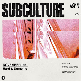
Emma Janero does the graphics for indie events company SUBCULTURE who I discovered through the client. I'm a big fan of the work - especially as it is such a small events company, similar to what my client is starting up. I decided to look into Janero's work further because I wanted to do some more focused analysis on event branding rather than just posters.
Janero's work feels very similar to what I had in mind for my own work at the very beginning: a sans-serif logo with a slight twist paired with some grainy gradient-mapped imagery. I think that it's becoming a staple combination for brands such as these because it simply works so well. Now when you see a graphic such as this you have an idea of what it is advertising to you. However, I'm aiming for this project to do something more ambitious because I have simply seen this style used so much. Janero does it well - and I think that her work for SUBCULTURE is a good example of an indie events company, I especially admire the way that she has created a template to add new imagery and text into as time goes on and more vent happen - I definitely need to create something along these lines for my client.


No comments:
Post a Comment