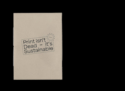
- Using the paper stock Gmund Bier Lager (on this particular mock up it looks really dark?) for the front/ back cover. I really like the effect of having a different coloured front and back cover - I also like the way that the inner covers have been utilised as this perpetuates the 'use as much as you can' idea. However, I'm not happy with the colour of paper stock. I feel that it looks un-inviting and bland, as well as like a manila envelope. The tone of voice is informative and professional, however I feel that this stock is too cold and boring.
- I'm really happy with the layout of information within the design. I took a long time to lay out each page and kern the text. There was A LOT more text to sort out than I realised but I think that the end result is successful.


No comments:
Post a Comment