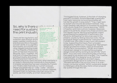
When tweaking the design for my final outcome, I realised that there was actually an uneven amount of pages. I saw this as a good thing, as one of the aims behind my design is 'less is more' so being forced to take out another page and condense some information was a good and relevant challenge.
I'm really happy with the stripped back layout I ended up with. I think that the typeface and paper stock give the publication some character while the layout adds some seriousness. All together, I think that the tone of voice is clear. I really wish that I could see the whole thing printed, I keep imagining how future editions would look with different coloured stock for the front, back cover!


No comments:
Post a Comment