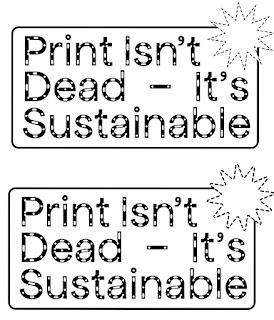
When designing the front cover/ logo for the publication. I wanted to create some contrast to the inner pages. My plan is to lay the text out in a way that takes up as much space on the page as possible in order to have minimum waste. I thought that on the front cover, however, that there should be a reverse approach in order to create some contrast. By just having the logo on the front cover, it creates some ambiguity - making the reader open the publication up to read more. I think that this approach is successful - I feel that it makes an impact while remaining professional and interesting.
In terms of the logo - I went back to the one I had designed previously but made some tweaks. I adjusted the kerning and leading but most importantly switched the stroke to a dotted line to mimic the shapes used within the typeface Apfel Brukt. I really liked this approach as it visually makes a strong connection to the typeface so I will use it as a motif throughout the publication.


No comments:
Post a Comment