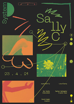
Re-introducing bit-mapped/ gradient-mapped imagery per client's suggestion.
Re-introducing graphic notation post peer feedback.
Combining the two.
Colour variation.
Adding more notation + imagery. This looks strong but also really busy? I think that with a little more development and refinement, having more on the poster could work.
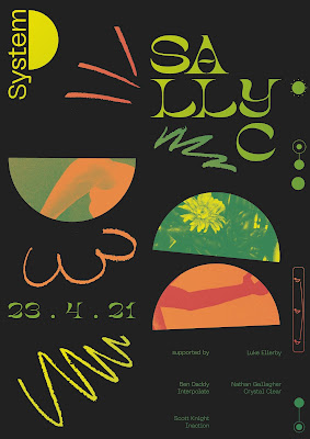
Bringing back the half-circles. Gives the logo a little more context.
Too simplified possibly?
Changing my grid to utilise more rounded shapes. Again, a nice idea - and could work with a little more refinement? I think I'm struggling with combining these different ideas: graphic notation, round shapes, found imagery etc? Something to ask about in my crit tomorrow.
In response to the feedback form my last developments, I used my layouts to experiment some more with colour schemes and visuals.
I really wanted to work with that warm, earthy toned colour palette some more, as the hues visually communicated the emotions I discovered in my research.
Orange: energy, interest.
Yellow: ecstasy, joy.
Green: admiration, trust, acceptance.
One thing that I want to work on is the inclusion of red. It's a great colour to use due to it's deep hues, however, the connotations revolving around anger, rage, etc. are what I want to avoid at all costs. Perhaps, a more lighter toned colour scheme? Despite this, I really like how the colours work on top of a darker background. They show up a lot better and I love the contrast it creates - almost like night and day. As well as creating an effect that visually communicates this night/ day contrast, the use of dark grey also has connotations with the type of equipment used to make the music, like synthesisers for example, that are often this colour.
Prior to developing these experiments, I showed my client a select few examples of the work that I was producing. He was really positive, however, surprisingly said that he preferred the very initial poster that I made for him before the project even officially began. This was a shock, because when I made that poster, it took approx. an hour and had little to no research or deeper meaning behind the visuals. I simply made what I thought a techno club night poster should look like, and in my (slightly more professional) opinion, it was no where near as good as what I'm producing now. I asked what it was he liked about the initial poster, and he said the gradient mapped, abstract images were what stood out to him.
Hence, here as well as experimenting with colour further, I wanted to see how I could re-introduce those images. I thought about using the imagery that I collected, but this was not abstract enough. Even here, I think that the flower sticks out like a sore thumb whereas the snapshots of arms in motion look really strong and have connotations to joyfully dancing to the music.
I also wanted to take on Lucy's suggestion of re-introducing my graphic notation. I was really happy when I realised that taking it out of it's raw form and adding in context to something else (in this case my grid and existing imagery) meant that it fit in a lot better and had potential.
Peer feedback:
- Experiment with the weight of the lines. At the moment, everything is a similar weight and it looks quite clunky. If I made the graphic notation thinner, then it would be a lot more refined and bring more attention to the smaller type. I also think that the smaller type should always be a brighter colour so that it doesn't get lost within the design.
- The small elements taken from the synthesizer work really well and should be a bigger feature within the design. To get further shapes, use circuit symbols to link to the electronic vibe.
- The images work really well, and stop the design from looking flat. Paired with the graphic notation, they create a feel of motion and dancing.
- The logo looks more relevant when paired with a design that uses semi-circles but looks lost otherwise. Despite this, it does look strong when paired with a fat display type (like Noer shown above). You could add thin lines to resemble a vinyl - this would also correlate with utilising thinner lines within the design.


No comments:
Post a Comment