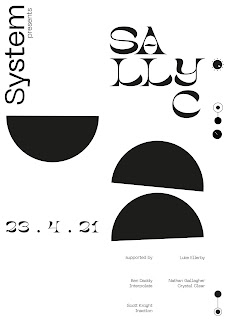
I obviously wanted to experiment with some different typefaces, so I started off with Neue Machina. It's inspired by the aesthetics of robotics and machines - "a typeface well suited for the future of technology" hence, perfect for electronic music.
First time trying it - too big, awkward.
Making small adjustments, decreasing the size.
Moving elements around so that they fit the space better. The LLC of Sally C looks like a face, reminding me of the classic rave smiley, so I changed the text line to highlight this.
Trying out different combinations and styles - this sans serif typeface is so clean that it works well when paired with a bold display serif.
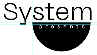
Finally, I started playing around with quick logotype ideas. When messing around with poster designs, I was seeing the name System and the half circle, and decided to see how that would work as a logo.
I think that it's an okay start - it definitely needs improvements. The idea is that half circle represents the rounded shape theory I found in my research but also has connotations to the rave smiley, with a more modern feel. To further that, the white text looks like teeth at the top of the mouth, a subtle nod to the idea.
While I was experimenting with the logo idea, I contacted my client to double check that he's okay with the text reading System Presents rather than simply System. I think that this makes a lot more sense and makes the brand feel more considered. He agreed that this is what he wants so I'll make sure to include it in further experiments.


No comments:
Post a Comment