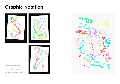
This morning I shared the work that I've done so far in a more formal crit. I was looking for feedback on my visuals/ ideas. The main points I came away with were:
- The ideas are strong, relevant, and interesting. The look is contemporary and visually pleasing.
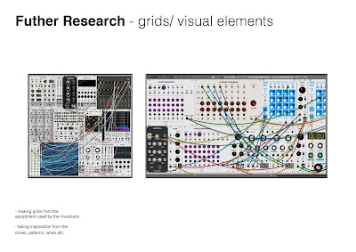
- The main word to take away from this crit is SIMPLIFY. I've experimented with different idea, but they need to be paired back in order to work together. At the moment, there's so much going: imagery, grids, visual elements, graphic notation, type. I either need to go down one or maybe two avenues or find a way of making it work.
- Despite this current issue (not really an issue, just something to reflect and work on) visually, the contrast between the grids and rounded shapes work really well. I agree with this, and it's not something that I initially picked up on. Furthermore, this contrast has links to my research about rave culture and shedding one personality to adopt another. I really like this connotations and it's something that I didn't even intentionally do. However, adding the bold extras like the graphic notation kind of gets this a bit lost - something to work on.
- I got really good feedback from Arthur, who's done a similar outward facing brief in the past (he also knows a lot more about the genre/ culture than myself). He said in regards to my client preferring my initial poster, that this was probably because when small DJ's say they want to "stand out" they don't really mean it, so when you show them ambitious design it won't appeal to them. It's a tricky line because they want to stand out, but also want to blend in. He recognised that my initial poster was more of a cliché techno club style, and pointed out that that was why the client liked it. The solution he gave was to simplify my design, maybe change it up to appeal to the client a bit more, but still work my ambition in there in a more subtle way.


No comments:
Post a Comment