1. Obvious icons and illustrations
Starting simple, I want to have a go at going forward with simple illustrations/ icons. Not too trend drive, just some easy visualisation of key themes/ content from articles like I've already been doing.
2. Journalistic 'oldy-timey' style illustration
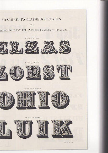
When thinking about what styles I could experiment with, I thought back to my research into the magazine Private Eye. I remember at the time I was intrigued by the little illustrations that accompanied their branding. There's an obvious connection to traditional newspaper comics/ jokes/ illustrations, but they also reminded me of glyphs I had seen in Type: A Visual History of Typefaces and Graphic Styles by Jan Tholenaar.
I've always been really inspired by these detailed illustrations that accompany type for printed matter. They're historical and interesting. It could be really interesting to take visual cues from these for the design of Glad Print, for example the black line style, the box etc.
3. Large and fun abstract shapes
Alternatively, I could go down the avenue of big, colourful, engaging shapes. This would create a lot more focus in colour and texture, which could be an interesting avenue to experiment with.
4. Loose, abstract people
These large, loose shapes could take on the basic form of people. I hadn't previously considered illustrating people within the sine, but doing so in a creative way could link to my yoga/ mindfullness themes.
5. Basic block shapes
This idea was inspired by Dom's mention of simple, minimal design and her example of greeting cards by Ola. In a way, it's designing with everyone in mind - easy to digest, easy to understand.


No comments:
Post a Comment