Another simple illustration for 'Electronic waste is on the decline!'
Set up for print - with this smaller size, two publications can fit on one sheet of A4 - meaning less waste.
Another crossword design
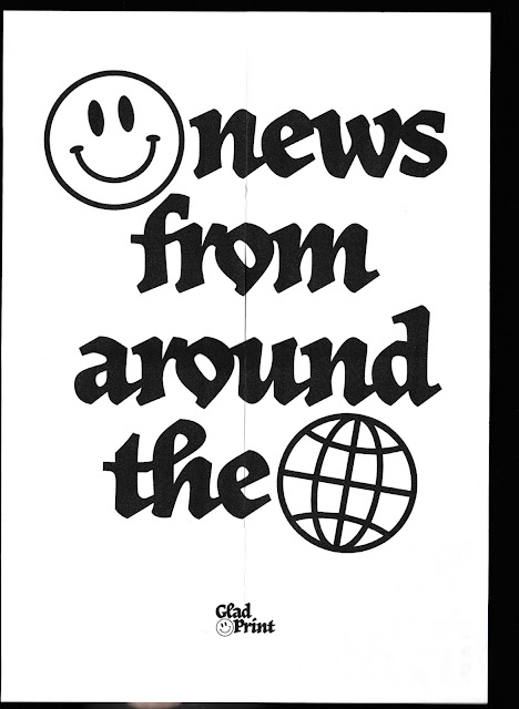
A5 print/ poster size
I'm really happy with my third zine experiment. When I originally imagined a 'mini-zine' this A7 dimension is what I had in mind. I also think that it makes a lot more sense just having one article spread out across the 6 pages - it's much easier to read and understand, it kind of makes the reader pace themselves more?
If I go with this size though, I'll have to take into account the design considerations that come with it. The text I used for the crossword puzzle was much too small and barely readable. It would have to be spread out across two pages. There's also little room for images but that's justifiable, as I didn't want to have any imagery used within the publication in the first place.
The only issue is that with the smaller size, the poster element becomes A5 size - much too small to cover a traditional newspaper. I'm thinking the newspaper blocker could be a separate element - an A3 poster folded down to maybe A5, then packaged up with the zine?
Now that I've made three zines, I was reflecting on the formats that I've experimented with and what I could do next. They're all quite similar and traditional - and I want to try out something a little more unconventional. I was thinking back to We Sow's zines and remembered how long some of them are. I think that I want to try out this longer format because it reminds me of the long columns of text and images used within traditional newspapers. There's loads of ways that I can try this - a vertical concertina thing? A long strip of paper rolled up and secured with an elastic band? Lots of interesting folds?
Different form thoughts: wilder, more experimental. Like We Sow - long articles with interesting folds or rolled up, inspired by long columns of text in newspapers.


No comments:
Post a Comment