Saturday, 27 March 2021

And Now For The Good News by Ruby Wax

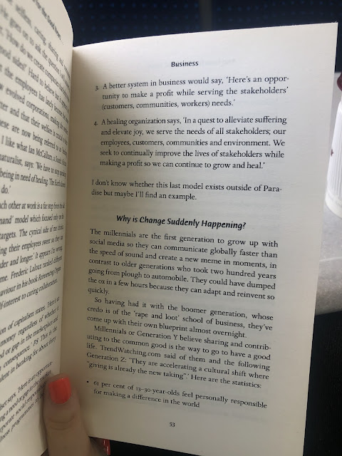
When I carried out my questionnaire and asked people for examples of where they find positive news, one person wrote that they were currently reading And Now For The Good News by Ruby Wax. For my research, I ordered a copy and I've been reading it alongside making work. My initial intention was that it would give me some content for whatever I made, however, it's not really written in an appropriate way for that purpose. It's more of a written insight into Ruby's travels around in search for some positivity and touches on society and mental health quite a lot. Despite, it's still been really useful in prompting me to think about some particular things: 


Within the business section of the book, Ruby discusses 'conscious consumerism': a new type of business model and way of thinking that new companies are taking on. It involves the three elements of conscious consumerism: purpose, mission, and vision. Even though Glad Print isn't a company or a business, it got me thinking about my own responses to this 'hierarchy of principles'. Obviously, if Glad Print were to grow and hypothetically become a proper bi-monthly edition sort of thing, it would follow conscious consumerism, as this aligns with the intentions of the brand. 

Purpose, refereeing to the difference you want to make in the world. The purpose of Glad Print is to randomly distribute positive information, surprising people with optimistic news stories to brighten their day. A further purpose is to interrupt the way that we currently interact with the current news media outlets. How can we approach the distribution of information differently and in a more considered way? One that looks out for us instead of trying to scare us? 

Mission, the way in which you will achieve your purpose. The way in which I'm aiming to achieve my purpose is to actually physically produce a decent amount of 'zine packs' myself and distribute them accordingly. I want to put them in places where people will find them and them pass them on. I'm a little bit worried about putting them on trains/ buses because I think with the current pandemic they would simply get thrown away. Maybe I could order some of those little single wipes and stick them to the outside packaging? I'm not really sure. 

Vision, how you see the world once your purpose has been achieved. I think that my vision is a far-fetched one, as pessimistically I can't see the way in which we consume news as a society changing radically anytime soon. But ideally, I would love for news to be distributed to us a little bit kinder. With the rise of smartphones, graphic imagery is shared on the six o clock news that people watch as a family, a long with some pretty horrific language/ stories. I understand that it's so important that this information be shared, but I think that we've gotten into a monotonous routine where we only share the negative without a second thought. 

(For example, when I was in high school I was forced to listen to a phone recording of a victim of 9/11. At the time, it was completely unrelated to whatever we were studying in English Lit, but my teacher felt it appropriate to traumatise a group of 12 year olds by making them listen to the recording. I feel like the premise is similar, there are ways to inform and educate that are more appropriate than fear-mongering and scaring.) 

We're constantly being exposed to negativity everyday on the news. I wish that the same amount of effort was put into uplifting people, encouraging them, and reminding them of what's good in the world. 


Above: some good examples of positive change that I could try and find articles on to use as content. 

Type Inspiration: Cheltenham Bold and Newsagents


I follow NY Times on Instagram and I never noticed how nice their graphics are till now, as I'm obviously paying much more attention to things like this in hopes of inspiration.

For their posts and stories they use a simple white/ black/ grey colour scheme along with the use of images with text overlaid. The monotone colour scheme is obviously inspired by traditional printed newspapers and suits the tone of the brand: professional, informative. 

I was mainly inspired by the typeface that they use. I found it it was a mixture of Cheltenham Bold and Cheltenham Bold Italic (along with Helvetica for body text and information). As time has gone on throughout my time at uni, I've been gradually getting more and more interested in typography - which is a good thing. I can't really explain why but I felt that this typeface had a really appropriate feeling to it. Probably because the designers at NY Times did their research and picked Cheltenham because it has some sort of interesting connection to printed news. 

I'm definitely going to have a go with designing with it, I'm excited to see it paired with the journalistic style of illustration as I think that that will feel really connected and appropriate.

While I was thinking about type I started thinking about type that surrounds the news that also isn't so obvious. I thought about local corner shops and how the signage is always quite quirky and unique, often retro with interesting colours. This isn't a new idea within the project, as I have thought about designing for corner shop signage previously. Taking direct inspiration from the type used would be quite an interesting route.


type: Cooper Black. Red and blue colour way with shadow effect. 


Bold sans serif type in red and blue colourway


Serif font, kind of similar to Windsor, paired with italic serif font, script-like. Red and blue colour way again. 


similar (more modern) type: Beni Bold. Again, a red and blue colour way, a theme? 


type: Impact MT


type: Novarese Std Ultra


https://www.bbc.com/culture/article/20200325-a-cultural-history-of-the-beloved-corner-shop


I've got a lot of things to experiment with here, which is a good thing. I also had a quick look at the above article which discussed the history of our corner shops. Although it wasn't very helpful, it provided the above image of hand-painted shop advertising which could be an interesting visual to experiment with. It's a little bit far-removed, but it could work?


I remembered that shop fronts and signage have always been something I've been inspired by. The above image I took a while ago and added to my random inspiration folder. Although it's a shut down fish shop - I feel like the premise is still the same. There's something really appealing and almost comforting about these 'retro' signs.  

Things to experiment with: 

- Cheltenham typeface
- Red and blue colour combination
- Shadow effect
- Bold sans serif

Thursday, 25 March 2021

Design style ideas


1. Obvious icons and illustrations


Starting simple, I want to have a go at going forward with simple illustrations/ icons. Not too trend drive, just some easy visualisation of key themes/ content from articles like I've already been doing.


2. Journalistic 'oldy-timey' style illustration


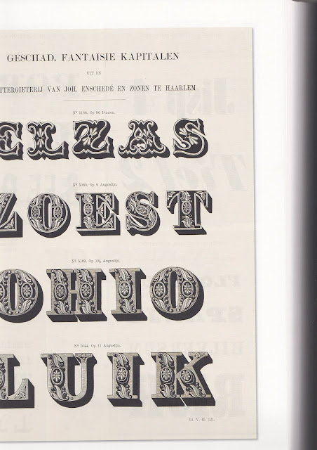
When thinking about what styles I could experiment with, I thought back to my research into the magazine Private Eye. I remember at the time I was intrigued by the little illustrations that accompanied their branding. There's an obvious connection to traditional newspaper comics/ jokes/ illustrations, but they also reminded me of glyphs I had seen in Type: A Visual History of Typefaces and Graphic Styles by Jan Tholenaar. 

I've always been really inspired by these detailed illustrations that accompany type for printed matter. They're historical and interesting. It could be really interesting to take visual cues from these for the design of Glad Print, for example the black line style, the box etc. 


3. Large and fun abstract shapes


Alternatively, I could go down the avenue of big, colourful, engaging shapes. This would create a lot more focus in colour and texture, which could be an interesting avenue to experiment with. 


4. Loose, abstract people


These large, loose shapes could take on the basic form of people. I hadn't previously considered illustrating people within the sine, but doing so in a creative way could link to my yoga/ mindfullness themes. 

5. Basic block shapes


This idea was inspired by Dom's mention of simple, minimal design and her example of greeting cards by Ola. In a way, it's designing with everyone in mind - easy to digest, easy to understand. 

New Module Plan


Tomorrow: 

Go to uni and pick some paper samples. Scan them in so that you can consider them when designing. 


Over Easter:

Experiment with design style. This can be mainly digital, looking at type/ illustration/ colour. 

If you don't like the paper you picked up from uni - try and find some from somewhere else, maybe order online?

Think about packaging and get that ordered too.

When you're not designing, start your design boards! Even just planning them out/ doing the research and initial ideas ones will help. 


Back at uni:

Time to start refining chosen design style. 

Printing

Mockups 

Discussion future goals/ aspirations 

Final presentation + design boards

25/03/2021

 - How could participation be a form of distribution related to your brief? 

Encouraging people to further distribute the zines. They'll be left in public spaces, they could have a design saying 'leave me for someone else to find, or if you want your own copy - purchase at GladPrint.com! etc' then they get further and further distributed.

Workshops could also be a form of participation. It could be a future consideration, but Glad Print could collaborate with a yoga studio or somewhere like Belgrave to put on sessions, which could then be covered in the zine. This could extend further to mindfulness sessions or mental health discussions. 


- Justification of your identified platform for communication 

Printed media ensures that everyone can access positive news. Due to the distribution and size of the project, it will only be found by chance, so having an online element where the zine can be purchased/ news can be shared is also necessary. 


- Are there any possible ethical/ social/ technological/ cultural concerns? Even if their aren't write about it to evidence your consideration

Like ADAPT mentioned in their presentation today, some news is sensitive and relevant and shouldn't be dismissed or covered up. They distributed stickers for their audience to stick on newspapers - but made sure to instruct them not to stick them on headlines with sensitive topics. 

There's also the issue of not bashing the media of the news. Some people do, as I found out through my research that the news is filtered down to us which make people angry and untrusting. However, this is not the aim of Glad Print. Glad Print is about spreading positivity, so bashing other media outlets is wrong.

Analysing my 503 feedback


I wasn't expecting the best grade for this module as I wasn't the happiest with what I submitted, and I had to use an extension for the first time so I didn't feel very confident with my outcome. I'm surprisingly really happy with not just the grade but also the feedback, as it made me realise that I did do some things right throughout the module. 

Things I did well:

Picked a relevant brief and enthusiastically engaged: I feel confident as I think that I've done that again for 505. My brief feels relevant to me and I'm having fun responding to it. 

Solid evidence of in depth research: I can agree with this because I do really enjoy the research stage of a brief, it's one of my favourite parts of a module. I like that it's very open and there's little pressure - it's full of ideas and new thoughts. I also always make sure to evidence all of my research clearly on my blog. 

Good evidence of development: I was happy to see that Pete though I had good development as I was doubting it myself. I often have the struggle of not exploring enough ideas but that's something to improve. As for development, I do think that I use my ideas and research to carry stretch out an idea, maybe just not enough. I do appreciate though how Pete has acknowledged 'good evidence' of development as I do tend to blog a lot, and sometimes I think maybe too much. 

Things to improve:

More varied experimentation at earlier stages: I know that I really need to do this as it's my feedback for every single module. I just struggle with really exploring more than one idea as I get to focused on the one that I like the most. In terms of Glad Print, I've got an avenue that I like and want to go down, and I'm struggling with coming up with different routes to explore. I think that comes from a mixture of limited feedback and my own way of working. 

Final details: I thought that this comment was a little bit nit-picky but I do completely understand, and even learnt something from it. I wasn't sure whether to include a digital version of my poster on the client presentation or a mock-up, and now know which is more appropriate. At the later stages of a module, especially this one, I tend to ignore little details like that and think about them less. I'll ensure that for this one keep my momentum up until the submission. 

Push ideas further and take risks: I know that this is something I struggle with and I'm struggling with it right now with the current module. I've really been trying to push myself but I do struggle with momentum. I think that a couple of weeks ago I was doing great at bashing out a lot of zines and pushing my ideas, as I would think of something and tell myself to just get on with it and do it. I struggle with keeping that up, though, and recently have been lack-lustre at even producing work. I think the key to it all is just to keep up my momentum and keep going. 

Consider how you might extend the creative opportunities with a brief: This one I do feel confident about as I'm already thinking about this with Glad Print. Because it's such a relevant brief to me, I've already stated how I want to continue it past the submission, as I think it would just be so fun to do. My plans for a social media page excite me and I know that it's something I can turn into a side-project and carry on doing. In terms of all briefs, though, I'm definfately going to start questioning the longevity and how they can go further past the deadline. 

Visiting Professional - ADAPT

 Richard Ashton and Josie Tucker

Adapt is a climate club and creative organisation using design, humour and contemporary design to communicate climate issues in a new way. 

They do:

- Education and learning 

- Creative and culture 

- Tactical change making

They utilise humour and contemporary culture as a tool to make their audience feel relaxed and open to learning. 

They keep language light, fun and personal to give themselves the opportunity to be more hard hitting when necessary. 

They us Instagram to test out their designs/ topics on their audience - get feedback, help them decide whether to make it a bigger project or not. 

They think that social media can be used to make change. They use the 'Post Insights' to gage how their audience is interacting with the information that they publish. They could gage what people were happy to act on. 

They design stickers designed to go over front-page news. The message keeps getting seen, re-used, distributed. It was a nice way of sharing something tangible with their audience. 

Fracking banner - thinking about making something that can be used again. A further purpose. 

Tate Modern: Climate Change Speed Dating Workshop. 

They designed a fake Metro News cover to distributed around London. Hi-Jacking newspapers. There are so many tiny bits of information that goes into it: Adverts, gossip teasers etc etc. 


Hearing ADAPT talk about their work has definitely got me thinking about the range of my product. How far it can be pushed, different applications. Especially as a lot of the stuff they discussed relates to my project. All of their projects are very different and vary in size - billboards, scarves, zines, posters, social media. But all of it links as their core message is really strong. 

I've got the zine distribution thing but I really need to think of something solid that matches my core message. I've been thinking about yoga sessions and other things that we do related to mindfulness but nothing concrete is coming to mind at the minute.

Tuesday, 23 March 2021

QR Code/ Instagram


At the start of the project I made a Glad Print Instagram account, just to find out if the name was available or not, and I've kept it inactive for now. As I start to think more about range, I generated a QR Code that links to it that I can use within the publication. 

Now, for my development, I can start to think about designing for digital media to the QR Code has something tangible to link to! 

Range Presentation


Thinking about my range, I definitely think that Glad Print should have some form of digital element. However, I think that the way in which I go about this is very important and a bit difficult. I don't want the digital element to be too important within the whole thing, for example - I don't want the printed publication to give only the headlines/ the beginning of an article then a link to a website which has the full article because I think that this excludes a large part of my audience. 

Within my brief I discuss how children as young as 8 are accessing news on social media, and how important it is that whatever I make be accessible to them. However, I also think that because everyone of all ages accesses the news, positive news is for everyone and shouldn't exclude any ages. By having the full articles online I know that I would be excluding an older generation. The feeling of picking up a zine with positive news then not being able to read it all would be similar to that of reading an article online then having to pay for a subscription to read the rest - it's annoying. 

So, I want to avoid this. The publication will have the full articles in them. I still want a digital element, but I'm not sure what form this will take, what it will include, what it's purpose will be, or what it will look like.   

It could be that there is an Instagram which is simply an extension of the zine. The zine will be distributed broadly so it will only be found by chance, the Instagram is a more solid platform where people can choose to follow if they wish.

For the range I'm feeling okay. The publication in itself will be a range of stories, printed on separate stocks and packaged together in a minizine pack. This minizine pack can include a range of things: 
Obviously the zine
prints 
posters 
stickers 
pencil (for puzzles)
The publications themselves could double up as a poster, a bookmark etc. 
Thinking about different size of articles, there could be the traditional poster zines, some that could double up as book marks, and some that are the shape debit cards so that the fit in your wallet? The wallet idea came from The Happy Newspaper's subscription cards that I blogged about in my earlier research: 


I really like this double use idea, especially the bookmark, as it has connotations to mindfulness and calm. The little wallet card thing is cool as well, as you can keep it with you and see it every now and again. I tried to think of some more things that I could produce, pieces of printed matter that have more than one use that link to that calm feeling:

plant tag


coaster 


tea bag label


cup holder 


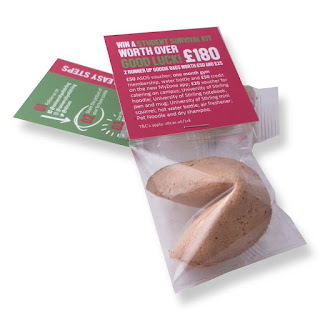
fortune cookie


greeting card
card game
pencils

I also looked back at my past blog posts, and found that I had previously considered:

Corner shop signage 
A scarf
Flyers 
Card game 

magazine with free toy packaging vibe

Module Evaluation

This module has been really positive for me. I'm so glad that I chose the issue that I did, because I felt passionate and motivated the ...