Thursday, 31 December 2020

Existing Imagery: Maneuver


Above are some of the graphics that Luke had made for his previous events company Maneuver. 

Luke explained that the posters were made using images taken from club nights that have been collaged together - if you look closely you can see dj decks as well as hands and lights. He also had a logo made (the broken rectangle). The issue that Luke was facing with these posters was that they are all so similar in design, he actually began to have people asking him if the events had been postponed and were being re-advertised. I can see from the examples that he has given to me that this is evident, and when Luke let the designer know about this problem he received designed that looked to far gone from the original concept (images 4, 5, and 6). Overall - the designs are uniformed and lack a real sense of a brand. 

Luke also mentioned that the square logo didn't work because it had no real relevance to the events company and he felt that it didn't represent what they were doing. 

The two things that I need to keep in mind that Luke has mentioned is that the posters need to be different from one another and that the logo must be text based. 

Tuesday, 29 December 2020

Final Mock up


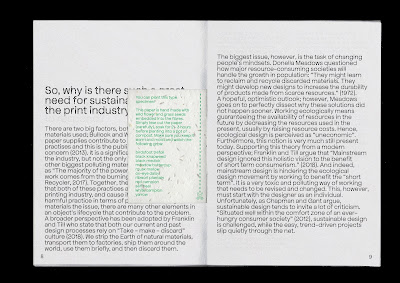
When tweaking the design for my final outcome, I realised that there was actually an uneven amount of pages. I saw this as a good thing, as one of the aims behind my design is 'less is more' so being forced to take out another page and condense some information was a good and relevant challenge.

I'm really happy with the stripped back layout I ended up with. I think that the typeface and paper stock give the publication some character while the layout adds some seriousness. All together, I think that the tone of voice is clear. I really wish that I could see the whole thing printed, I keep imagining how future editions would look with different coloured stock for the front, back cover!

Chosen Paper Stock


My paper from G F Smith finally arrived which was so helpful in actually choosing what stock I will use for my final product! Actually being able to see and feel the paper in real life made a huge difference in the decision. 

I had already decided on the stock for the type specimen - the seeded paper. I wanted to make sure that the other two stock I used complemented this choice as best they could in order to make the whole publication as cohesive as possible (especially as it is such a small document with not many pages). 

For the inner pages I went with Neenah Environment PC100 White 118 GSM. This paper is lovely - I wanted to avoid shiny classic-magazine-style paper as this doesn't feel or look sustainable. This paper has a very very subtle shine in the light and is soft to touch. 

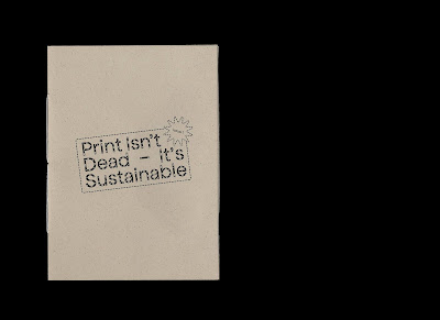
For my front and back cover I went with Gmund Bier Weizen 135GSM. After my previous mockup I thought that I would choose something more colourful, however, this paper stock is beautiful in it's subtlety. It's qualities mirror the seeded paper so well that that it brings the publication together as a whole. It is a warm off-white with brown speckles. 

I'm finding it really difficult to show off how well the paper works together digitally. I downloaded the digital versions from G F Smith but their scans don't seem to do them justice. For my digital mock up of my final publication I'm going to try my best to digitally edit them to reflect the real life effect that they have. 

Monday, 28 December 2020

First Final Design


- Using the paper stock Gmund Bier Lager (on this particular mock up it looks really dark?) for the front/ back cover. I really like the effect of having a different coloured front and back cover - I also like the way that the inner covers have been utilised as this perpetuates the 'use as much as you can' idea. However, I'm not happy with the colour of paper stock. I feel that it looks un-inviting and bland, as well as like a manila envelope. The tone of voice is informative and professional, however I feel that this stock is too cold and boring. 

- I'm really happy with the layout of information within the design. I took a long time to lay out each page and kern the text. There was A LOT more text to sort out than I realised but I think that the end result is successful. 

Monday, 21 December 2020

Logo/ Front Cover


When designing the front cover/ logo for the publication. I wanted to create some contrast to the inner pages. My plan is to lay the text out in a way that takes up as much space on the page as possible in order to have minimum waste. I thought that on the front cover, however, that there should be a reverse approach in order to create some contrast. By just having the logo on the front cover, it creates some ambiguity - making the reader open the publication up to read more. I think that this approach is successful - I feel that it makes an impact while remaining professional and interesting. 

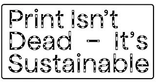
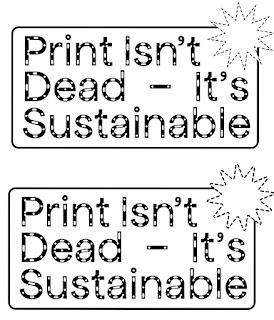
In terms of the logo - I went back to the one I had designed previously but made some tweaks. I adjusted the kerning and leading but most importantly switched the stroke to a dotted line to mimic the shapes used within the typeface Apfel Brukt. I really liked this approach as it visually makes a strong connection to the typeface so I will use it as a motif throughout the publication.

Paper Stock


Neenah Environment Grocer Kraft


Neenah Environment Concrete


Extract Mustard


Gmund Bier Ale


Extract Ember


Extract Coral


Gmund Bier Lager


Extract Cactus


Gmund Bier Pils


Extract Aqua


Extract Moon


Neenah Environment PC100 White


Three favourites: 
Extract Aqua 
Gmund Bier Pils
Gmund Bier Lager

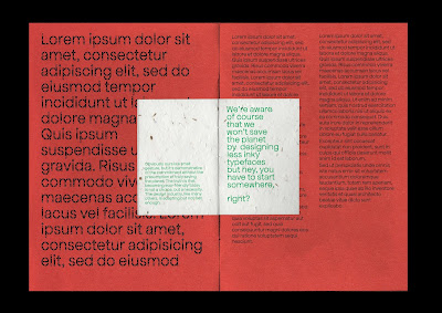
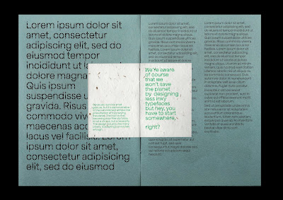
Thinking about how my mini type specimen would look against my bigger publication, I began to question what paper stock I will be using. The paper samples that I ordered from G F Smith still haven't arrived and with time pressing on I can't wait for them to make a decision. Instead, I decided to download all of the digital samples of the sustainable stocks to mock them up. 

I really enjoyed seeing the array of colours that are available - especially as they are all sustainably made! I felt that my three chosen favourites complement the off-white tone of the seeded paper as well as the green riso ink well. They also create the most legibility when paired with the typeface Apfel Brukt. (Colours of the paper stock may appear darker due to blending modes - this needs to be amended in the future).

However - after pondering the many different colours of stock I realised an issue. I plan on having images printed in my magazine. The printing process I'm using is Risograph so the images will be reduced to a maximum of four colour layers - but I still need to think about how these will look against the paper. Perhaps I will use Neenah Environment PC100 White for the inner pages of the magazine and a coloured stock for the front/ back pages? I think that this could add some nice diversity to the publication.

Module Evaluation

This module has been really positive for me. I'm so glad that I chose the issue that I did, because I felt passionate and motivated the ...