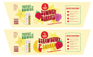
- Once I had the type and a general idea of how to make the packaging more effective, the creation process was quite easy. I knew that I wanted to incorporate fruit onto the cover and added small faces so that the anthropomorphise-ation was still present but didn't overwhelm the design. When so much colour was happening, simple was best in that situation.
- I tried really hard to keep a warmer colour scheme throughout, however, included some small hints of green and blue to keep the design more varied and exciting.
- One element of the design from the original packaging that I decided to recreate was the instructions and icons. I simplified them down a lot, because preparing food like this should become like second nature - and much like fast food should be quick and easy


No comments:
Post a Comment