- Pushing a summer feel, like Coca Cola, focusing on a creating the feeling of a time of year or season so that it creates an association with the brand
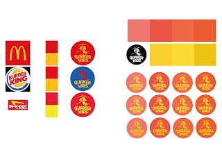
- Experimenting with a warm colour scheme for the logo, inspired by the idea that psychologically these are more successful in fast food branding. This was tricky, as I was attempting a non-harsh look, which upon reflection was working against me.
- The type used was also inappropriate and tired looking due to the traditional serifs


No comments:
Post a Comment