Saturday, 29 February 2020

Stickers


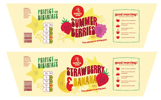
- I really wanted to incorporate a game element into my design as from my research I knew that it was a successful part of children's food branding. Both fast food brands and healthy food brands utilise this - for example, Proper Corn, Bear, Burger King, and McDonald's. 
- I knew that I would not have a lot of time to design a Top Trumps game like Proper Corn and Bear, however, after designing my fruit faces I thought about how good they would look as stickers. I realised that the oat pots have a foil seal and then a plastic lid, with space between where a sticker could sit. 
- I incorporated the text "Free sticker in every pot!" and book a slot ready to get them printed

Friday, 28 February 2020

Essay 2 Draft 1

What is The Relationship Between Brands And Consumer Lifestyles?

Fast food brands have particularly interesting connections with their consumers as they have managed to become so successful while being unethical in terms of healthy living. Eric Schlosser writes in Fast Food Nation (2001) that ‘The golden arches are now more widely recognised than the christian cross’ despite the rapid rise in obesity and changes of attitude towards fast food (fig. 1). Why is food that is so bad for our health as well as the environment so popular? The answer lies in the branding and how the product is marketed towards the consumer. Exploring the techniques used by brands to sell their products leads to questioning their ethics as well as how we, as consumers, use brands as a reflection of ourselves.

The whole point of branding is to be able to engage with the consumer to persuade them to buy the product at hand. Wally Ollins says in his book On Brand (2003): ‘Some of the cleverest brands, the ones that are managed by the people with sensitive antennae, are reaching out to create a relationship with society.’ This relationship Ollins speaks about is the successful product of good branding, and is what keeps a brand alive. Powerful brands use all-inclusive emotions to be successful worldwide, and they use advertising with social content that connects with people. Take for example Pepsi’s 2017 “Live For Now” advert (Fig. 2) that received a lot of backlash due to its failed attempt at using the language and the imagery of protest movements to connect with its audience. Pepsi mis-read their place within the current political climate and so faced a negative reaction from their audience, but this is a good example of brands trying to reach out through social commentary. 


Furthermore, brands are putting more effort into their relationships specifically with children, and this is made very clear through the statistics that David Boyle discusses in his novel Authenticity: Brands, Fakes, Spin and the Lust for Real Life (2003). Boyle reveals the extent that fast food brands in particular go to to connect with children. For example, 95% of the advertisements on children's channels contain food and drink that are high in fat, sugar, and salt. Moreover, ‘In the USA, McDonald's and Burger King run more than 10,000 playgrounds between them’ and even school’s textbooks are sponsored by fast food giants. It is shocking that these companies' main target audience is children, as their products are so unhealthy, yet unfortunately this is who they appeal to most and therefore where the money comes in. They also make no discretions when it comes to marketing their products towards a younger audience.


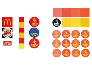
In comparison to healthy food brands, it is shocking to see how these fast food brands are steered towards children, and when their success rate is taken into account, it is no wonder why Americans spend more on more on fast food than they do on education. Despite the success of these brands being on a global scale, it is actually down to a few simple methods that Kate Bratskier outlines in her article The Tricks Fast Food Companies Use to Lure You in (2014). First, convenience - according to a 2006 Eating Patterns In America report released by The NPD Group, Americans will spend money on unhealthy food if it is made for them because they value convenience over their own health, and even, their children’s. Second, the mouthwatering vocabulary. Brands love to tell consumers what they want them to taste, for example, Subway’s “Eat Fresh!” (Fig. 3). Third, the colours of the brand play an important part of consumer psychology. Studies have shown that warm colours such as red and yellow activates hunger as well as grab attention, this is why these colours are used in the iconic McDonald’s logo (fig. 1) as well as others like Pizza Hut (Fig.4) and In-N-Out (Fig. 5).


The effect that these branding strategies have on society is extreme and dangerous for people’s health because they produce such a high selling rate. Ed Mayo and Agnes Nairn discuss the repercussions of fast food chains in their book Consumer Kids: How Big Business is Grooming Our Children for Profit (2009). From a societal point of view brands reflect who we are as people and help us ‘fit in’ with others. Parents don’t want their children to ‘go without’ and will follow consumer culture by buying unhealthy snacks and taking their children to fast food restaurants; ‘the food industry has products for all of this, competing for space in the lunchbox, knowing that it is easier to put snacks in, even if they are less healthy’. Due to fast food chains like Mcdonald’s playing up to this notion with products such as The Happy Meal (fig. 6) four year old children have double the amount of salt in their food that health professionals recommend, as well as cases of children as young as 5 with type 2 Diabetes. This shows that the branding strategies used by fast food conglomerates are working hard to market their products specifically towards children but poses the question: are they ethical? 

The answer to that question is no, and this is proven by the fast food businesses response to Ofcom’s research that revealed “foods high in fat,sugar, and salt account for 80-90 per cent of all TV food advertising spend” (Mayo, Nairn 2003). The response from the Food Advertising Unit, who are controlled by fast food companies with enormous research budgets, was to pay other academics to discredit the findings. This proves that the companies themselves do not believe that their products are healthy, and in turn know the damage that their global success causes, yet still hire people to lie and suggest that they are. Furthermore, even when rules are applied they do not go far enough. Markham Held discusses in his article How Food Labels Lie to You (2017) about how there is no legal definition of words like ‘natural’ so companies can trick consumers into buying their products. 

Somehow, fast food corporations have managed to spread ‘throughout the country like a self replicating code.’ (Schlosser, 2001). Despite being proven to be bad for your health. In recent years, however, consumers have begun to demand differences from them. The brands we buy from are a reflection of the type of person we are, so, as people begin to make changes brands do the same. For example, more and more fast food restaurants are offering vegetarian and vegan options, encouraged by those trying to be more sustainable and cutting out meat. Despite this, it is arguable that buying into these products still supports the larger idea and therefore makes little difference in the long run. 

To summarise, a final quote from Ed Mayo and Agnes Nairn’s book Consumer Kids: ‘The moral is that if you want to encourage responsible advertising to children, then you have to take an approach that addresses the full mix of marketing and not just a part of it’. Thus meaning that it is not simply the advertising that is the problem - the issue lies within the brands themselves, it is imbedded within their individual ethos’. If people stop demanding change from fast food companies, they will continue to have a negative impact on society as a whole.


Images 
Fig. 1, McDonald’s Logo

Fig. 2, Pepsi Advert

Fig. 3, Subway’s Logo and Tagline

Fig. 4, Pizza Hut’s Logo

Fig. 5, In-N-Out Burger’s Logo

Fig. 6, McDonald’s Happy Meal


Reference List

Boyle, D. (2003) Authenticity: Brands, Fakes, Spin and the Lust for Real Life. Harper Perennial.

Bratskier, K. (2014) The tricks fast food companies use to lure you in. Available at:

Held, M. (2017) How Food Labels Lie to You. Available at:

Nairn, A. and Mayo, E. (2009) Consumer Kids: How Big Business is Grooming Our Children for Profit. Constable.

Olins, W. (2003) On Brand. Thames & Hudson Ltd. 

Schlosser, E. (2001) Fast Food Nation: The Dark Side of the All-American Meal. Penguin.

Essay 1

What is Branding?

Branding is predominantly influenced by the social climate of the time. Defined as ‘A fundamental part of companies, organisations and even individuals’ (Davis, 2009, p.12), branding has and will continue to change throughout history. Why? Because the consumer grows more and more aware and in turn less influenced by the current attempts at selling that brands make on them. But why is it so necessary for branding to constantly be changing, and how did it come to have such an impact on companies and consumers alike in the first place?

Although constantly changing with the times, branding first began as a series of symbols to represent a shared belief (fig. 1). At the birth of religion, humankind agreed that there was a higher power, but not what this higher power was. Symbols for Christianity Judaism, Hinduism and more were created to represent a belief, a way of thinking. Debbie Millman (2019) noted that - ‘We manufactured meaning around something we agreed meant something’. These were the first brands known to mankind. Although not all of society agreed on the ideologies of differing religions, the representation of the symbol was agreed upon. At this time branding remained only a way of representing something that society agreed on the meaning of, it was later and in other circumstances that it began to have connotations specific to ownership. In the seventeenth century cattle farmers appropriated the word ‘Brund’ from Old English poem Beowulf which meant ‘to mark or destroy by fire’ (Millman, 2019). For centuries cattle farmers had been marking their cattle to differentiate their own from others, but this is when the word was first used. Already, there has been developments in the way that branding is utilised. Starting out as something that a society agreed on and recognised, brands have shrunk down to the mark of an individual - representing not a generalised belief or way of thinking, but a simple mark of ownership. 

Similarly to brands today, the marks that livestock were branded with represented the farmer, but attached to this was a strong sense of reputation (fig. 2). If a particular farmer used a specific practice and their product was of good quality, this would become synonymous with their particular brand. There is so much more that comes with building a successful brand in today’s climate, however, at the start it was simply your practice and quality that would make your brand successful. Examples of this were shown further throughout history within the production of pottery in China, India, Greece, and Rome. The potter would stamp a mark into the piece that would represent themselves, the materials, and/or the historical period (Rajoram, Stalin Shelley 2012) to show the presumably rich upper-class consumer, the quality and finery of the product (fig. 3). This idea of ownership prevailed throughout the years and in the 1200’s English bakers and goldsmith’s etc. were actually required to put their own mark on their products to ensure a specific quality. Branding once again had developed and was now a required symbol to ensure honesty towards the consumer. Even to this day specific brands have a reputation as the “best” in their field, such as Cadbury’s for confectionary or Dyson for the house-hold vacuum. These brands sit at the top of the long list of products for good reason - they have a connection with and are trusted by their consumers. 

Much like consumer culture, branding expanded with the Industrial Revolution in England. Due to the explosion of mass production it was no longer enough for a baker to rely on his name being stamped on his product. The middle-class was quickly growing and with it, the production of products in factories. This idea that items for the home were no longer a local, recognised product but something that was produced on mass by factory workers was completely new, and it was now down to companies to brand their wares rather than the individual. Buyers were able to choose from a wide range of products and so the business of branding grew. ‘With buyers now able to choose from a wide selection of products for the first time, logos were used to not only indicate the manufacturer, but to act as a symbol of quality.’ (O’Neil 2015). Companies stuck to using marks and symbols to represent themselves because this is what the consumer was used to - of course, what we know them today as is logos. At this time laws were enforced due to the upper-classes demanding regulation on quality. Another huge development for branding - that the small mark on a product held so much meaning and represented so much. This is when we first start to see the importance of brands' histories being recognised by the consumer. That ‘local’ feel of a brand is always more successful as this is what audiences were used too and are more comfortable with. Even today, brands tend to focus on their origin story and “humble beginnings” as a selling point rather than the mass production occurring in factories, because that is not as appealing to the masses. For example, Hovis’ strapline - “As good for you today as it’s always been!” represents the rich history of the brand, as this is what they are trying to sell (fig. 4).

In the twenty first century the technological world has exploded and in this time, branding has managed to develop and change quicker than ever before. Debbie Millman (2019) said: ‘Branding is now a manifestation of the human spirit’ in relation to today’s brand climate. Post Industrial Revolution big corporations dominated the market. However, thanks to the “dot com wave” in the late nineties, this same market was expanded world-wide. The emergence of online-brands grew, however, those with little substance that were manufactured quickly failed to prevail. But what Millman was referencing was not the new exciting companies on the scene, she speaks of the likes of Oxfam, Black Lives Matter, and #MeToo to name only a few. In the twenty first century some of the biggest and most recognised brands don’t even belong to a corporation, but are charities and organisations made for the people, by the people. Now the consumer is so much more aware and is able to challenge a brands ethos if they think that it does not match up to the standards of society today. For example Melissa Davies (2009) said: 'The US and Europe's financial crisis has coincided with a desire to consume less, alongside pressing environmental issues such as climate change’. Brands are no longer focusing on their story and beliefs, but are being forced to change by the consumer. 

Taylor Holland (2017) sums up the development of branding well when he says: ‘Branding in the twenty-first century is still about taking ownership. It’s about owning what your company values and represents, owning up to your shortcomings, and earning customer trust and loyalty through your words, your actions, and your stories’. The development of branding throughout time has shown some interesting changes. It is interesting to see how the idea of branding started as something that society agreed upon, developed into being designed solely by one individual, only for society to once again have such a huge impact on brands in the twenty first century. Trying to find an answer for the question “What is branding?” is impossible due to its complexity and differing opinions, however, Tony Hardy (2019) says: ‘branding is almost intangible’. This is a really accurate representation of what branding is today - something that can not be defined as a mark of ownership or set of rules. But as something that is constantly changing, a reflection of society. 


Images 
Fig. 1, Religious Symbols

Fig. 2, Cattle Branding

Fig. 3, Potter’s Mark

Fig. 4, Hovis Advertisement

Reference List

Davis, M. (2009) The Fundamentals of Branding. AVA Publishing. 

Hardy, T. (2019) What is Branding?,  Available at: 

Holland, T. (2017) What is Branding? A Brief History, Available at:

Millman, D. (2019) The Complete History of Branding in 20 Minutes. AIGA Design Conference. Available at:
https://www.youtube.com/watch?v=QdsBGphzVJI (Accessed 12 November 2019). 

O’Neil, E. (2015) History of Branding. Available at: https://www.lcca.org.uk/blog/education/history-of-branding/ (Accessed 13 November 2019).

Dr Rajoram, S. and Stalin Shelley, C. (2012) ‘History of Branding’, International Journal Of Social Sciences & Interdisciplinary Research. Volume 1, (March).

End of Module Evaluation


This module overall has been challenging, as I have struggled with combining type and image. This limited me a lot when it came to experimentation and stopped my designs from looking professional, as they were lacking strength in either one or the other. I also struggled with image making, something I thought that I was good at. This was due to the lack of processes that I experimented with, sticking to mainly digital, which restricted me. In the future, I need to focus more on interesting processes like photography and collage and ensure that the ideas are interesting enough to produce good outcomes from these techniques. When creating imagery, it’s always important that the idea is well thought out and realised, something that I need to remember in the future. Furthermore I actually really enjoyed the research for this particular module. It was extensive, however, splitting it up into the categories of conceptual, contextual, and practical made it very manageable (working in a bookshop was also helpful in researching and analysing current book covers).


I think that I could have been a lot more experimental within the module and produced some better results if I had taken the plunge and gone further with ideas. I had a lot of ideas at the beginning and didn’t develop them individually to their full potential. For example the ‘holes in science’ idea had potential, but because I was struggling with producing outcomes I switched to developing the notebook because it looked visually stronger to me. Granted, I didn’t have a lot of time to develop both, but I should have managed my time better from the start. The easiest part of the module for me was generating ideas from my research. Because I had so much, it was really fun to sift through it and think of a wide range of ideas for designs. Despite this, I found developing my ideas the hardest. Getting past the first outcome seemed to be impossible and my ideas did not change visually enough. 


In terms of the final outcome I feel that I pushed the idea to its full potential. I tried out a lot of things with that particular idea such as collage and physically making it, and this development led to substantial outcome. However, in terms of the module as a whole I feel as though I have not done my personal best. The imagery that I have created and worked on it not as good as it could be and when I look back on the work I have made I am not as impressed as I have been with work in the past. To avoid this in the future I will ensure that I am developing work that is at a standard I agree with and am proud to present. 


Furthermore, throughout this module I tended to ignore peer review if it wasn’t what I wanted to hear and this really limited me in terms of the amount of development that I produced. Despite this the development for my notebook idea that came from my crits was influential to the final design. I tended to avoid peer feedback as I wasn’t proud of my work and didn’t feel like showing it to others, and also sometimes felt pressured to make a substantial amount of work for the crits which in turn made me stressed and the quality of my work worse. In future modules I will definitely try to work at my own pace and not worry about how much work I am showing in the crits. 

Tuesday, 25 February 2020

Packaging Development


- Once I had the type and a general idea of how to make the packaging more effective, the creation process was quite easy. I knew that I wanted to incorporate fruit onto the cover and added small faces so that the anthropomorphise-ation was still present but didn't overwhelm the design. When so much colour was happening, simple was best in that situation. 
- I tried really hard to keep a warmer colour scheme throughout, however, included some small hints of green and blue to keep the design more varied and exciting. 
- One element of the design from the original packaging that I decided to recreate was the instructions and icons. I simplified them down a lot, because preparing food like this should become like second nature - and much like fast food should be quick and easy

Final Holes Development


After the unsuccessful development for the holes idea involving rotating, I decided to give it another try. I went back to the basic layout I had created using Garamond and physically cut out holes once again. This time, however, I was precise in order to create a more subtle effect. I used the scanner to scan in different variations, including some more experimental, random layouts. It's a shame because I personally prefer this abstract style, but it sacrifices legibility for style. Taking them further digitally, I tried to incorporate image but  I struggle with legibility even more here. I think that my notebook idea response in comparison is a much better blend of type and image and works better together. Here, the texture is fighting against the type in an unpleasant way. 

Monday, 24 February 2020

Holes in Science Development


Even though I have developed my notebook idea to a cover that I am happy with, I still wanted to develop my 'holes in science' idea as I thought that it potentially could produce some successful covers. Inspired by Experimental Jetset, I modified Helvetica by rotating the type using circle shapes. I like the jagged / wavy effect but the overall tone of voice seems to not fit the brief how I want it to. I think that it's an attempt at being too commercial and is therefore boring. The colour, type, layout etc. are don't say contemporary because the idea is not fully developed. The one thing that I do like about it is the grain - I think that if I went back to my grainy textures then this could produce some more interesting results.

Thursday, 20 February 2020

Type


- Continuing on from the more appropriate theme, I decided to change the typeface that I was using for the main element of the design - the flavour
-Previously I was using Windsor, a vintage-feeling sans serif font that was not at all appropriate for the packaging. It gave it a sense of a contemporary brand trying to hard to be retro and cool
- I decided to revert back to the font I originally wanted to use - Frito Vandito.
- "Frito Vandito is a psychadelic throwback to 1970's van culture, dripping with nostalgia and handmade funk. Inspired by the free-wheelin' and free lovin' nomads traveling the country in search of nothing but unforgettable life experiences, this type style lives on mainly in photographs and memorabilia buried in history."
- Although still a nostalgic typeface, Frito harks back to the seventies - a much free-er and happier vibe compared to Windsor. 

Tuesday, 18 February 2020

Change of Direction


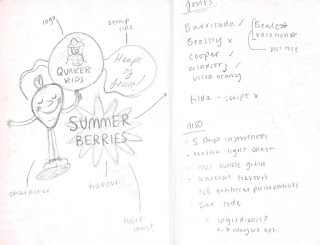
- I was really struggling with the development of my packaging design as I was thinking about it from too much of a branding perspective, rather than a fun "what would a kid like to eat?" perspective. The colours that I were using were too mellow and the whole design idea was rather retro (in a bad way) that would not appeal to kids
- My friend gave me some really good advice and managed to pull me out of this rut. She told me to instead visualise bold shapes and bright colours - things that appeal to children, and try and inject fun and silliness into the design. It made me think back to my crit when I was told that parents enjoy fun and engaging packaging because it gives children '30 second of fun'
- I began to completely let loose and sketch out wacky faces whilst visualising bright colours and interesting textures. Instead of also overworking the fruit imagery with so much detailed, I stripped it back and cut them semi-neatly out of coloured paper to produce blocky shapes. 
- This was such a huge and hopefully successful turn around for the practical outcome that will produce kid-friendly packaging that parents will want to buy 

Possible Final Outcome


- After the crit I knew that I wanted to explore both of my ideas further so that I could choose a final design from one of the two. I had a vision of the notebook cover being simultaneously neat and crumpled, so that it could fit the style that I wanted to achieve while still communicating the idea of a beaten textbook. I wanted to visually convey the idea that Bryson struggled with science at school without being too literal, i.e. using an obviously crumpled textbook. I like how in this design the idea is subtle, the crumples only noticeable when you look close at the back and front cover labels. This idea is also subtle referenced through the typeface used for the title - H K Gothic, a 1950s American typeface. The Smile in The Mind element of making a play on something familiar also links back to my earlier research and, in y opinion, is more desirable to Penguin. 

Tweaks I want to make:
- The grid on the back cover could be ever so slightly rotated so that it looks like it's been stuck on incorrectly / carelessly
- I want to re-write the reviewers names on the back cover as they were rushed
- Perfect the layout of the body text on the back cover 
- Rotate the small piece of masking tape so that it isn't so close to the edge

Crit


Reflect

  • Must develop both notebook and holes in science ideas further - these are the two best ideas that I have explored. 
  • The notebook idea may be a too literal representation of what it is communicating (Bryson's notes). It is also not as unique as the 'holes in science' idea - as others in the class are using notebooks (although this doesn't really matter).
  • I was going to develop the notebook design further by simplifying it, however, does this make the idea less conceptually strong?
  • The holes in science idea is actually good and has potential (I was going to scrap it).
  • Another justification for the design could be that when the book was first published it was not 100% accurate. 

Speculate 

  • Think about the audience they are trying to reach - a university student etc. - what cover would they want sticking out of their tote bag? The argument in the crit was that the hole design was more contemporary and all round 'cooler' so that would be the obvious choice. However, I still think that by developing the notebook design and scrapping some elements that it could be a good contemporary design. 
  • To develop the notebook idea further I could batter the book up before scanning it, this would be more visually interesting. 
  • Someone suggested incorporating drawings / scribbles but from my previous designs I know that this did not look successful. 
  • It was suggested that I could make it interactive and leave space to draw. 
  • From my reflection I will develop the notebook idea further, however, I will do it in my own way. I do want to experiment with a 'battered up' version but I am determined to make it into a successful contemporary cover. 
  • I will, however, also experiment with the holes idea as it has potential. 
  • I can do this by making the idea more subtle - creating a glitchy, 'sciencey' type design. 
  • I can also develop it by adding colour - possibly a gradient to the grainy texture. 

Contextualise 

Experimental Jetset 


Experimental Jetset's designs for NAiM Jean Prouve and SMCS have inspired me in terms of my holes idea as for development I need to be looking at different ways of working with type. Instead of having the type and the idea on separate layers, why not modify the actual type so that it visually communicates my idea.


Zine found in Manchester - an interesting way of representing 'holes' in science. 

Monday, 17 February 2020

Development


- Attempting to continue with current theme by developing a anthropomorphised fruit character
-  This was interesting in theory, however, with the current colour scheme and type situation the outcomes were tired and boring, completely unsuitable for children's packaging. 
- This was a big struggle and was taking up a lot of time, the detail going into the illustrations was too much for the overall feel of the packaging. 

Notebook Idea development

Went back to exploring the notebook idea because I thought that it had potential. In my crit someone mentioned the idea of making it physically and then scanning this in, leaving a border to show sticky notes and paper sticking out. I ordered component books and while waiting for them to arrive designed my own labels for the front cover. I wanted to make the cover look familiar so stuck to the traditional design while changing the text to the cover copy. I really like this idea as it links back to my research on ‘A Smile in The Mind’ as it’s taking something familiar and changing it to induce surprise. I think that combining this along with hijacking an object could make for a successful cover design. 

I was really happy with the object that I had made when I stuck all of my elements onto the book in preparation for scanning it. However, during the process I realised that I would have a lot more freedom in terms of layout if I scanned in a plain book and then assembled it digitally. This would be further beneficial as I wand this design to be clean and professional.

Saturday, 15 February 2020

Initial Ideas


- Inspired by fun, retro, child-like packaging. Aiming for a much younger and approachable feel
- Pushing a summer feel, like Coca Cola, focusing on a creating the feeling of a time of year or season so that it creates an association with the brand
- Experimenting with a warm colour scheme for the logo, inspired by the idea that psychologically these are more successful in fast food branding. This was tricky, as I was attempting a non-harsh look, which upon reflection was working against me.
- The type used was also inappropriate and tired looking due to the traditional serifs

Thursday, 13 February 2020

Crit


  • Take the logo further and don't be afraid to stick to the traditional style. Re-brand as much as you want. Try customising the Quaker man illustration, change his hat etc, 
  • Explain in the essay introduction that your main focus it fast food brand's strategies and how they are successful but unethical. This is a good summary. The aim of the practical project is to make a healthy brand do the same thing as the fast food brand in an ethical way. 
  • A bit of consumer research - apparently games within food products for children create family satisfaction as well as product satisfaction. It's getting more for your money, even if it's just 30 seconds of joy. If I don't manage to design a full set of cards / game, it could just be a tear away element of the packaging or something inside the pop-off lid. 

Wednesday, 12 February 2020

Logo


- Modernising the logo while still maintaining the iconic Quaker Man. Fast Food chains with people in their logos have flat colours that simplify the image and make it recognisable and transferable, e.g. KFC and Wendy's. 
- Dropping serifs to make logotype younger and modern while still looking traditional and strong. A similar style to the very minimal McDonald's packaging, less is more.
- Experimenting with holding shapes, very basic - looks more child like, however, needs to be developed.  

Module Evaluation

This module has been really positive for me. I'm so glad that I chose the issue that I did, because I felt passionate and motivated the ...