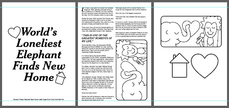
Experimenting with Cheltenham Bold/ Italic typesetting
Bringing in simple illustration
Thinking about layout, always informed by newspapers - two column, header at the top, large quotes etc.
Simple 'coaster' format experiments - logo on the back, article on the front.
Returning to the long format inspired by long pieces of text in a newspaper that can be used as a bookmark.
Updated poster zine.
The zine that I produced was a7 size (printed on an a4 sheet and folded into a posterzine) but I'm beginning to think that this is too small. If I to go with this, the text has to be larger as it's almost unreadable. I'm also wanting to experiment with that middle fold inspired by Good Press and this wouldn't be possible with this size.
For some reason I had some printing issues with this copy? Not too sure why but something to think about in the future - I don't like the way that the black page has moved up.
The same thing happened to the long article - I forgot to trim the top and bottom before I folded so the lining up is completely off. I need to pay attention to these little details before I print/ fold next time.
I also am going to need to rethink my bookmark/ long article format. I tried using this as an actual bookmark and it was much too long. I don't think it would be a problem shortening the height at all - when I took some dimensions from articles in the newspaper there were some shorter ones that I could use. I would also re-think the fold, eg. just three folds instead of the four above or even just one. This is okay though.
I'm not too sure what to make of my coaster idea. I really like it in theory and I think it's an interesting idea for range. It's forcing people to think about the further aims of Glad Print. Yes, it's a zine that publishes positive news, but the idea was also born out of looking into our mental health and how we can look after it. It is a little bit cliche to say 'have a cuppa with your mate and everything will feel better' but talking to a friend does help, and I think within this context it works.
Physically, however, this experiment was nowhere up to scratch. Obviously I was just using my printer at home with normal printer paper so they were so thin that they didn't even really read as coasters. I definitely got the sizing right first go so I can pat myself on the back for that but I still need to rethink.
Obviously one option is to order in thicker stock and see if it can go through the printer or alternatively screen print it - but I think that this takes away from the ease of the project? It's supposed to be easily produced at home so that I can publish future issues so I think that becomes a bit too complicated.
One solution I thought of was having the coasters be open-up-able. Multiple pages would be good because on this format the text was really really small and probably difficult to read anyway, so having multiple pages would mean that I could increase the point size. It also means that I could half the article in one coaster and half in the other - which I really like the idea of because if you're using them between two people like intended then you're kind of forced to communicate. A bit like a weird talking exercise.
Example of the range at the minute - I think it'll look more impressive once I've started experimenting with colour - WHICH I REALLY NEED TO DO. I also keep saying that I need to make 'tweaks' but I think I really mean changes - changes to the format and the design. What I'm thinking is:
- Main poster zine = try out a bigger size, try out the middle fold
- Long zine = try out format that's more bookmarkable
- Coaster zine = just make it work better, flesh it out a bit more, extend it across more pages
- Just start using some colour jesus christ, I think that the black and white thing does work to an extent, if it were printed on some nice paper stock for example. However, this is too in the realm of newspaper inspired for me. That's already visible in the choice of text, the layout, and the very premise itself - there needs to be an outlet that's more expressive and unique, and I think that's colour.


No comments:
Post a Comment