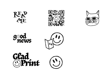
Sticker designs
Colour inspo
Colour scheme
Individual sticker packs
Coasters
Now that I've finally finished the production of my main element: my zine, its time to start on the range, and for me that's the stickers and the coasters (it actually also means the instagram content and the events poster but coasters and stickers take priority as I need to make use of digital print to get them done - so the sooner the better).
Thankfully I've already put some time in to design the stickers throughout the process of designing the zine and collated them together, so now it was just a case of coming up with a colour scheme. I went back to my visual inspiration that I've been collating throughout the module and picked out some images that I thought were great examples of the use of bright colour combinations as that's what I wanted to achieve.
As I mentioned in my previous blog post, I decided to go with the natural, muted paper stock for the zine so that the colours within the other elements could really shine - so it had to be good. I came up with the above colour scheme: three darker hues and three lighter hues that pair well together throughout different combinations. There's also of course red in there to tie in with the zine further.
I think it works really well! It's bright and playful and fits the tone of voice that I'm trying to achieve. I'm going to further utilise the colour scheme that I've generated for the poster and Instagram content to ensure everything ties together and a sense of branding starts to develop.


No comments:
Post a Comment