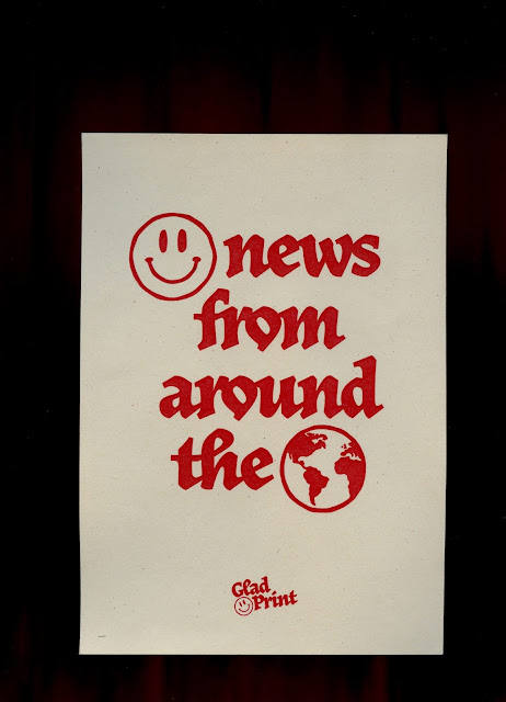
I managed to get into the studio to start printing - so I experimented with colour combinations between ink and paper stock by printing my digital tests. I had a variety of pastel-y/ off-white stocks from Fred Aldous and G F Smith to play around with, so I was excited to print different colours on them and judge the outcomes.
From the results, I'm pretty pleased with all of the ones on the brighter coloured stock options. Three of them are on sugar paper/ recycled paper that gives off a grey effect that's quite dull and doesn't fit the positive tone of voice, or offset the design as nicely as the others do.
The G F Smith Color plan stocks in Candy Pink, Sorbet Yellow, and Pistachio however, are very successful. I'm really pleased with the effect of the outcomes. Matched with the coloured overprints, they give off a colourful and fun effect that matches the content of the design perfectly. I'm really pleased with the colour combinations that I came up with as it feels contemporary and appropriate, as well as almost ephemera inspired due to the pastel tones.
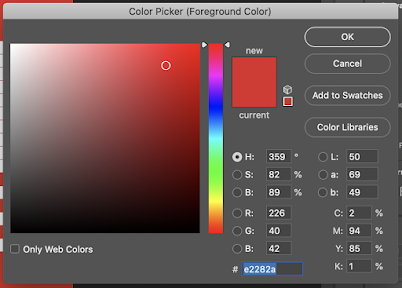
Despite this, my favourite of all the print tests is the bottom image - a red ink printed on G F Smith Color Plan in Natural. I decided on the natural, off white coloured paper as I knew that I would be including a load of bright and colourful stickers/ items within the zine pack - so I wanted this one element to be slightly more muted to off set them well. I also liked the links with The Sun newspaper's red and white logo - and I think this comes through within the design. It's a great paper that is bright and complements the red colour very well.


No comments:
Post a Comment