Friday, 30 April 2021

Location/ Context photos


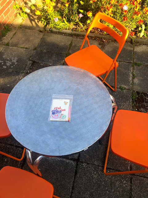
FINAL scans of zine pack


Coaster and sticker development


Sorting out the coasters and stickers after picking them up from digital print was a bit of a whirlwind and gave me lots to think about in terms of production. 

I had asked James before sending off my file if it was possible to cut my coasters out in the print room. He said that unfortunately that material was not compatible with any of their machines so I would have to take it to the 3D workshop instead. 

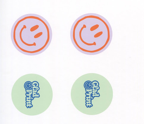
When I picked up my coasters I noticed the first issue - which was that they were too small. I had sized them correctly, ensuring that they were 94mm in diameter and on an A3 illustrator artboard. I had even specified this to James in the print specification. However, James had flipped my artboard so that it became A4 and printed it on an A3 sheet of mountboard, meaning that the coasters were too small and a lot of the material was just wasted. 

The same issue happened with the stickers. I sized them correctly on an A3 illustrator document but James had flipped them to be A4 so that he could fit two pages on each sheet. This wasn't as much as a problem, it just meant that I ended up with smaller stickers and double the amount that I needed. A couple of them also had ink rubbed off.

In hindsight, I should have mentioned to James that he had printed my files wrong when I picked them up. But alas, as it was so close to the deadline I decided to make do with it and continue. My next battle was the issue of cutting the coasters out:

I took my mountboard to the 3D workshop and asked if I could use the laser cutter to cut them out. I think the guy that I was speaking to in there was a little bit confused. I guessed that because I (obviously) had the illustrator document for the print file it would be fine to set it up on the laser cutter, but even so the guy sent me up to the screen printing room instead as they would have a circle cutter. 

It was at this point that I realised I was at my wits end and there would be absolutely no way that I could use this method to produce any decent amount of coasters. I realised that I was going through this experience because I wanted to have a physical example of what my final zine pack would look like, but hypothetically the production would involve outsourcing the coasters from a website that professionally prints them onto proper beermat material and cuts them out. 

Thursday, 29 April 2021

Developing social media content


Now that I've got my poster completed and my coasters and stickers sent off to print, the only thing left to do is the Instagram page. 

An external application of the zine, the Instagram page is a digital space to share more positive news articles, advertise/ sell the Glad Print zine, be a discussion space around positive news topics, share the crossword answers and advertise any external events. 

Developing the content was a fairly simple process, as as I've been developing the brand/ zine itself I've been thinking about how it will translate to this digital platform. I started of by taking all of my pre-existing elements into a Illustrator document and building up the posts using my colour scheme and illustrations.

I am happy with the outcome. I've developed social media content in the past and I think it's always best to go with a simple and eye-catching theme rather than posts with a lot of details. I've definitely achieved the right tone of voice here: bright, engaging and positive.

Guardian to be first national newspaper with biodegradable wrapping

The Guardian’s print edition will no longer be sold in plastic packaging, becoming the first national newspaper to switch to biodegradable wrapping

The Saturday edition of the paper contains a large number of supplements which are currently packaged in polythene to meet the demands of retailers and ensure they reach readers. 

From this weekend, the Weekend magazine, the Guide, Feast, and Review will instead be wrapped in a material based on potato starch, which readers are encouraged to compost or put in their food waste recycling bin. The packaging does not contain any genetically modified material. 

The change will increase production costs for the Guardian but is part of the newspaper’s plan to reduce plastic waste, following feedback from readers. The change will be phased in across the whole of the country over the coming months, starting this weekend for readers in London, Kent, Essex, Hertfordshire, Norfolk and Suffolk. 


It's a little late in the game for more research, but after sourcing out some packaging for my zine I came across this article about The Guardian's new compostable packaging. 

I'm kicking myself a little bit because if I had found out about this at an earlier stage in the process I would have really loved to look into this more sustainable option. It would also double up as a unique selling point, a page in the zine could be dedicated to describing how to plant it/ the things it could help grow etc. 

At this stage however, I don't feel that I have the time to order some new packaging. As well as this, it would be wasteful to disregard the plastic wallets that I've already purchased for the project. Alas, it's something to think about for the future. 

Wednesday, 28 April 2021

Poster/ Flyer scans


Now that I've developed the events poster I need to mock it up - but that comes later at the design board stage of the process. For now, I had the fairly simple idea that I could also print the posters out as flyers and actually include them in the zine pack. I didn't think of this before I developed the poster, but I think that it makes perfect sense to advertise the event within the actual zine pack. 

Glad Print X Headrow rooftop yoga event poster


Headrow's current advertising for their rooftop yoga sessions: 


Other examples of their content/ examples of their branding: 


Consistent use of imagery, type, illustrative marks:


An example of how they mix their branding with other's, this advert for a band playing at their venue:


Yoga session information:


Some visual examples of posters that I like. Illustrative, fun tone of voice: 


Info needed and thumbnails:


Initial idea using roof illustration idea:


Moving on to halftone image:


Two final selected outcomes:


 One of my external applications of the Glad Print zine is the 'mindfulness events'. Towards the start of the project I had this idea and didn't know wether to proceed with it as it felt too hypothetical, but I realised that I could visualise it through a poster. 

I wanted to evidence this idea for range as I felt it went perfectly hand in hand with the aims of my brief, and strengthens the mindfulness parts of my concept. 

I decided to choose Headrow House as my venue as it already puts on these rooftop yoga sessions so I knew that it would be plausible to collaborate - all of the information and logistics were already there and figured out. Furthermore, I felt that this reaches a wide target audience of people who would be interested in Glad Print. A lot of Headrow House's audience is students, but their activities and events also reach an older audience. It also is a hub for an active creative community and reaches a lot of creative people. 

I began the process of developing the event poster by looking at Headrow House's existing branding. The venue is actually partnered with an events company: superfriendz. I looked into them for a past project so I know that their graphics are done by Leeds based designer Conor Hastie. 

I took note of the common motif's throughout their advertising and branding: contemporary type, illustrative elements, bright and engaging colours. As the event is a crossover I wanted a successful mix between both Headrow's branding as well as Glad Print's. 

I started by finding out the two main typefaces they use: Garamond Light Italic and Helvetica Neue Extended and then working on my illustrative roof idea. Glad Print makes use of slightly naive style illustration, so I thought it would be a good idea to visually convey that through the roof drawing. On reflection, I realised that this was not working. I think that because the heading type has that minimal, contemporary feel, the illustration was just clashing and created a jarring effect. 

I instead decided to go with the classic halftone image instead. I think that this still visually relates to Glad Print as it eludes to the 'one colour overprint' style that I've used for the zine. 

Overall, I'm happy with the outcome of the events poster. As Dom has said, these elements are just applications of the developed brand, so it doesn't really matter that they're quick and easy to bang out. The poster over all has a simple, minimal tone but that's okay - it relates to both brands and conveys the appropriate information and that's all it needs to do. 

Module Evaluation

This module has been really positive for me. I'm so glad that I chose the issue that I did, because I felt passionate and motivated the ...