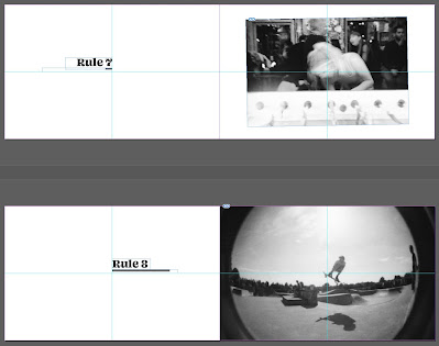
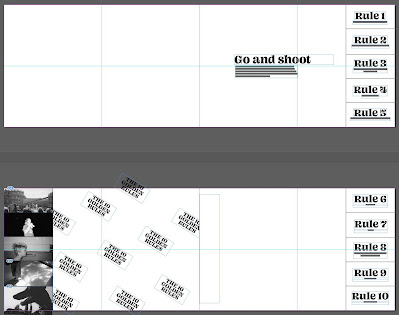
I went into InDesign and recreated my dummy copy digitally: front cover, intro page, ten double page spreads, two perforated pages, three die cut pages and a back cover. This is a BASIC layout that I can work off of and adapt to be however crazy or minimal I decide.
I was struggling with the layout of pages like 'break the rules' because I didn't yet have any rules to break. So I implemented a very basic grid: two by two. This was inspired by the lomo camera The Action Sampler which takes four pictures very quickly using its four lenses and produces interesting grid photos. As I was keeping it simple, the text simply shifted around the cross section in the middle. Upon reflection - I think I definitely go further with this whilst still keeping it subtle.
In terms of image layout - I also kept that simple. Some decisions are obvious, like 'shoot from the hip' being only in the bottom two squares for example, as well as 'get as close as possible' being all the way to the bleed. For the others - I simply made them 6 x 4 inches for now. I had a conversation with Orlando that has stuck in my mind. Everyone had been telling me that it would be a good idea to let the rules inform the layout, however, I had reservations and I wasn't sure why. Orlando reminded me of the quote: the word dog doesn't have to look like it's barking (or something along the lines of). He basically told me that it's okay to make it subtle - don't patronise the reader.
Furthermore this was the first time I had designed the perforated tabs pages. I struggled a little bit with body copy because once again, I didn't want to patronise the user and write 'now take these little tabs away with you on a photo walk and share them with your friends' so I kept it minimal and used some text from the Lomography website as well. On the backs of the tabs I used some photographs but I can already presume that these will end up being too small to look right. So, I'm thinking of incorporating some symbols that are used on the cameras like the lightening bold for flash. I also wanted to emulate an actual film photo and was inspired by the design on the back of one of my mums photos that I scanned. I just really liked the diagonal pattern of the logo so I remade it using my own. I'll have to wait until I print out a copy to see how effective this really is but I like how it would be recognised by people who use film only.


No comments:
Post a Comment