Monday, 30 November 2020

Amendment to interview with Luigi


Bound Art Book Fair


I tuned into the Bound Art Book Fair, specifically to watch Jade Montserrat in conversation with Nikita Gill (just because I am a fan of artist Jade Montserrat's work). 
Both women shared a few of their favourite publications, specifically zines - and I was really inspired by the late 90s zine Riot Grrrl that Nikita shared. 

She said: "There's something friendly about a photocopied, informal zine." and it got me thinking about the form of my own physical publication. The Riot Grrrl zine was made specifically to share information about the radical movement, and the hand-done, photocopied elements helped curate the punk aesthetic, and furthermore the zine aesthetic. 

I think that publication needs to be well balanced, but I definitely should keep these design elements in mind. My publication needs to be informative, and easy to understand. It also needs to think about how information is laid out on the page - because I don't want any wasted space. Finally, I think that after all of these elements are considered, I should try and relate it somehow to this classic zine look. 

Thursday, 26 November 2020

Interview Layout


As I got excited about Luigi's response, I decided to make another quick printed experiment of what it could possibly look like laid out on the page. 

In this experiment, it's hypothetically part of a magazine/ zine called 'Print Isn't Dead, It's Sustainable'. I'm thinking that it could be a really good idea to produce this zine and include the different sections of the interview, my essay, and a type specimen. Hypothetically, it could be published monthly and have interviews with different creatives, academic essays etc. 

I find that the layout of this experiment are much more conventional,  and don't really fit with the aims of what I was going with in the last one. I think I definitely need to work harder at sticking to create a layout that flows well.  

Wednesday, 25 November 2020

Zine Layout Experiment


To start thinking about possible layout ideas for my publication, I mocked up some pages to bind together. My key aim was to get as much information as the page as possible (for now I just stuck to lorem ipsum and used my key quotes from my essay for headings). 

I did these experiments in Illustrator, and taught myself how to do Text Wrap - as I think that this will be an integral part of the layout as it gets more words onto a page. I experimented with wrapping text around headings, quotes and images - and I think it's a really successful way of designing the layout to be more sustainable. I was shocked that I managed to get all of this text onto just two a4 pages, the aim is to use as little paper as possible so this was a success. I tried to use as much of the page as possible and leave little negative space. 

Furthermore, I used the typeface that I'm planning on using as a case study in my essay - Apfel Brukt. I was really happy with the outcome of this, as the type works well as both a display font and body copy. I was really shocked that it's still legible in a smaller point size due to the holes - but it works. 

At the moment, my plan is to just produce a visual essay. However, this experiment has got me thinking about how I could possibly be more ambitious. I mocked up a quick page specifically about the typeface, and thought about how I could produce a type specimen for it. 

Also, after I received an email back from Luigi at Collletttivo, I thought about how amazing it would be to include the interview in the publication. I think that it could possible be a good idea to modify my brief to produce a magazine. This way, the magazine could include: 
- My essay
- Interview with Luigi from Collletttivo
- Mini type specimen for Apfel Brukt 

This is definitely more ambitious than simply producing a visual essay because it has a couple more elements to it, however, I think that it could be really fun and successful. If I keep things in a simple, hand-done zine style (still much more refined than my first experiment, though) I think that it could be manageable.  

Response from Collletttivo


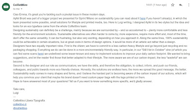
I was very happy to receive a response from one of the Collletttivo team, Luigi, the designer of the sustainable typeface Apfel Brukt! 

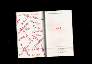
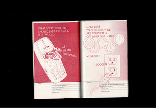
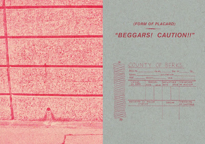
Luigi did an amazing job of answering my questions based around sustainability - and I'm definitely going to discuss his answers within the case study portion of my essay. He also pointed me in the direction of an article where he talks more about his typeface. Lastly, he also sent me some scans of a zine he produced with Colllectttivo not long ago all on the topic of sustainability - Still Hot In October. The publication is another great example of sustainable piece of print.


Visual Essay Research: Visual Insporation


Key Ideas:

Overlapping text and image
Overlapping text and text
Overlapping images
Filling out the page - information going onto the next page? 
Poster zine - could perhaps be better for fitting more info on/ activism
A hand done, archival feel - this is a DESIGNERS journey into becoming more sustainable - perhaps the tone of voice reflects that with layered paper, hand-written type, a sketch book feel? 
It should definitely feel like a collation of ideas pulled together, like a scrap book
I need to think about what my imagery if going to be, as this will be an integral part of the design layout

Visual Essay Research: Useful Work versus Useless Toil

 http://www.mottodistribution.com/shop/msheresies-2-rietlanden-women-s-office-on-useful-work-versus-useless-toil.html


Useful Work versus Useless Toil is the second publication of the MsHeresies series from the Amsterdam-based Rietlanden Women’s Office, a collaboration between graphic designers Johanna Ehde and Elisabeth Rafstedt “which engages in self-initiated, research-based graphic design, and publishing from a feminist perspective.”
The magazine’s main text is a remediation and republishing of the lecture “Useful Work versus Useless Toil” given by William Morris in 1884, accompanied by text and image material from the book The Sisters’ Arts, which examines the working relationship of sisters Virginia Woolf (writer) and Vanessa Bell (painter). This issue continues the project of the series’ first installment—Conditions for Work: The Common World of Women—to investigate the topic of work and the possibilities of collaboration from a feminist perspective.
Similarly to the work of of Joana Avillez, I am really inspired by the layout f this visual essay - and I find it to be really similar to IFILA! in that the text and image take up almost all of the page. There is not a lot of rom for negative space - they're using up as much as they can. 
I learnt in my research for my essay that ecological design should be function over form, and I think that by accident designers of publications like these are doing this. The function of the object is to inform readers about a topic- so not a lot of blank negative space is needed.  

Visual Essay Research: Ether McManus

 https://esthermcmanus.co.uk/Elsewhere


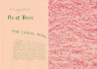
"In collaboration with the Institute of Historical Research and Senate House Library, I was part of the Stray Voices project which aimed to “stimulate insight into the buried stories of homeless men and women whose voices remain silent or unheeded within the historical record”.

To document some of the activities and scholarship from this multifaceted project, I produced the pamphlet Elsewhere, which brought together academic research, archival materials and documentation of a public walk and workshop. Through my pamphlet and workshop I was keen to explore how homeless- ness has been discussed in the UK over several centuries, and to highlight how current social debates and policies have their roots in the past."

Looking further into this zine-style of documentation, I am inspired by McManus' interesting way of showcasing archival imagery and photographs. I really like the way that she visually communicates the maps and grids, and how these relate to the accompanying words in an informal way. 

I think that within my own publication, I want to play with the balance between a hand-done, informal feel and a more serious tone. I think it also depends on the tone of voice of my essay, it highlights the serious effects on the environment, however also comes to an uplifting and optimistic conclusion.

Visual Essay Research: Joana Avillez

 I'm keen to use my essay as the content for my physical publication. I think that it makes perfect sense, creating a physical outcome that perfectly exemplifies the subjects discussed within the essay. In a way, the words and physical outcome will inform each other. In preparation, I want to do some research into visual essay, and how essays have been published in the past. 


https://www.itsnicethat.com/articles/joana-avillez-visual-essays-illustration-290818

"Joana Avillez's visual essays use drawing to say what writing can not." 

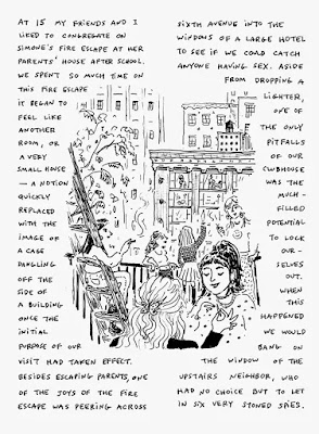
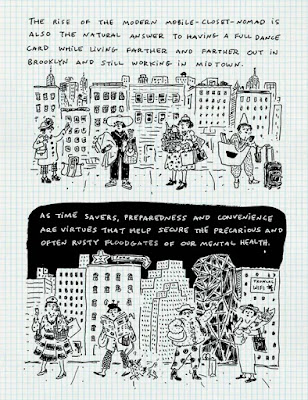
"Throughout her visual essays there is a strong sense of self warmly delivered by Joana’s hand. The illustrator’s passion for expressing herself is seen through her referring to her work as “a print-out of my brain”. Furthermore, the complementary relationship between text and image strengthens the rich communication as Joana likes “to use drawing to say what writing cannot, and vice versa… Sometimes it’s more useful to draw a facial expression than it would be to describe it — potentially flatten it — with words, like what happens when you explain a joke. I actually love both modes equally, and of course, most of all when they are together. You do in fact read both.”

I really like the way that Avillez visually communicates her essays. She's an illustrator, so her main focus is drawing and communicating ideas through illustrations. From my point of view, I think that her hand-done aesthetic is really fitting for the ideas I have about producing a zine. The whole idea about aiming for 100% sustainability is only truly achievable if everything is done by the creator. Furthermore, zine culture has big roots within activism - so I think this visual choice is really fitting. 
Also, the way that Avillez simply collates her words and images together in the page is similar to that of It's Freezing In LA! - a sustainable magazine that tries to use as much of the page as possible but still remain clean and simplistic so as to be east to understand. I also think that using illustrated images would be a really good idea as it makes information easier for the reader to understand. 

Module Evaluation

This module has been really positive for me. I'm so glad that I chose the issue that I did, because I felt passionate and motivated the ...