To begin experimenting with layout and the design of the publication - I started with the typesetting on the front cover. I started by using the typeface Clarendon, as I thought that it has a warm, nostalgic quality to it that would reflect the content/ ideas behind Lomography. Upon reflection, Clarendon was definitely the wrong choice - in my experiments it looks like it's trying too hard to be retro, and instead just looks dated.
Lining the text up with the 35mm mark
Using a grid of ten lines to represent the ten rules
Placing the text in the top right corner, where the flash is in most Lomo cameras
Lining all of the text up with the top of the page to reflect what you would see in a photo that has been 'shot from the hip'
I felt that all of the previous experiments were much too regimented and structured. Working with a grid didn't feel right as it didn't reflect the spontaneity and freedom of Lomography. I combated this by doing the exact opposite - I printed out my type (immediately, working physically felt more right), cut out my words and started dropping them on the scanner. This was giving me completely randomised compositions and layouts - which felt much more appropriate than regimented typesetting.

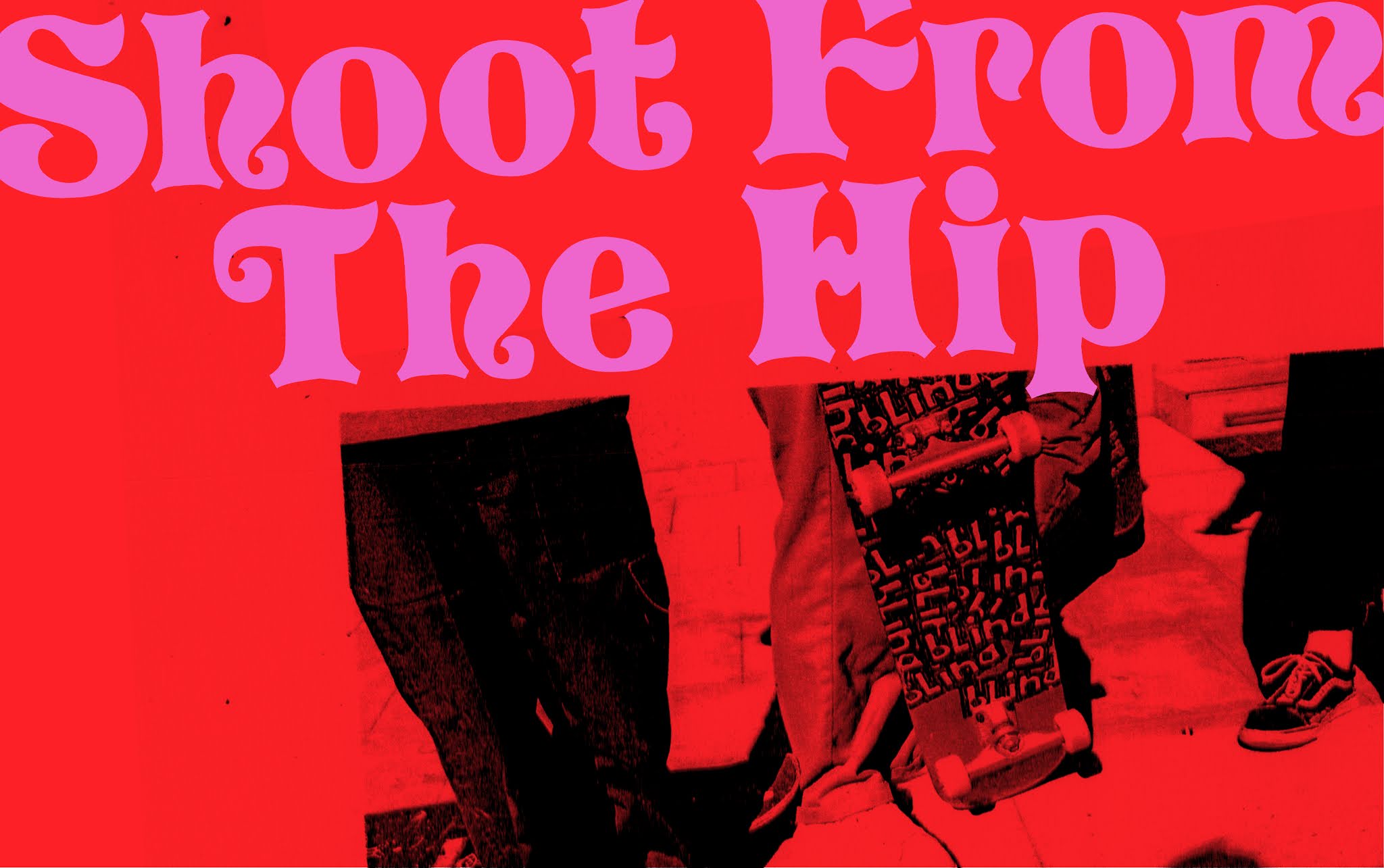
I realised that Clarendon was not the right tone of voice at all and searched for something different. I thought back to 'The Hull Countryway' - a publication that inspired me earlier on in the project. I used a website to find out the name of the typeface on the front - it was Pretorian. I really like this typeface due to it's decorativeness, and the way that it's such an old font (I'm not sure when it was made, but The Hull Countryway was published in the 80s) yet it's reminiscent of modern decorative typefaces, like the popular Eckmannpsych by OHNO Type Co. To me, Pretorian is a strange mixture of curly seventies serifs and Blackletter style ascender's (like on the d) which gives it a modern uniqueness.
Quick mockup of the idea of foiling the cover
Bringing in a circular shape to elude to a camera lens
As much as I love Pretorian, I did winder if it was perhaps too decorative. Upon reflection, I don't think so, Lomography cameras themselves are extravagant and decadent in their design. However, I wanted to try out something a little bit simpler. I did a bit more scanner experimentation with the typeface Souvenir, a sans serif font with soft, rounded features. I think that it looks okay - but it doesn't have the same kind of punchy impact as Pretorian. It's not as quirky - which I think the type needs to be.


As I liked Pretorian so much, I started playing around with trying to perfect the typesetting. I really like the way that the tops and bottoms of the letters look as though they curl around each other - so I wanted them to be close enough that this is noticeable, but not too close. I also brought the 10 down to fit into the gap above the 'en' and pulled the 'The' in to the centre slightly. I really like the shape that this gives the title as a whole - it looks like a crest/ mark/ stamp, which I find fitting. It almost eludes to The Ten Commandments in a way.