The idea of one minute book covers is not to achieve brilliant execution or immaculate technique but to generate initial ideas of how to respond and what processes to use. From my research I had the idea of visually communicating the tone of writing in the novel, and how it is written in an easy to understand way. I wanted to convey this in a witty, 'smile of the mind' way by using a dunce cap to be the familiar element, and to change the writing to 'Bill Bryson' to be the play. It was then suggested, as this was group work, that we use some sort of scale and have the hat pointing to a point nearly at the end to visually communicate the 'nearly' in the title of the novel. Upon reflection I think that this is two ideas battling with each other and henceforth has produced a unsatisfactory outcome. I want to achieve a cover that is simple but effective, especially as one of the notes on the brief was to pick out one element and communicate it well. Here, i think that the two elements trying to come together results in the wittiness being lost. The 'smile in the mind' does not work because the prerogative of the familiar, the dunce cap, has been changed to relate to the scale, rather than just represent what it needs to represent. I think that this dunce hat idea could still be effective and work if done correctly - meaning that it should be it's own entity and more simplistic. The good thing that I gained from the development of this unsuccessful cover was ideas for the next study task which focuses on type-only covers. I quickly messed around with kerning and I know that I want to really exaggerate this in the next task.
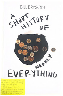
The next idea was to represent the quote "In perhaps the finest example in history of pouring money into a hole in the ground...". I think at first we definitely went too literal with this idea and produces some lack-lustre images that I have yet to try and develop into covers. We built an elaborate set up in order to get a clean shot of coins falling into a black hole but the outcome we wanted was difficult to capture with an iPhone camera. The effect of motion that the falling coins gave was slightly effective, and I want to start cropping and editing to see what I can do with them, however, I don't think that the quality in the images is really there. Due to this, I suggested that we interpret the hole in a different way by ripping one into a piece of paper and photographing it above the coins. I think this approach, though different to the first, is not as original or unique. I have to remember that these are 'one minute book covers' and so the execution is not great, but this idea just seems overdone. It got me questioning how I can push this 'hole' idea further - perhaps have the type be underneath the holes, only partly revealing the text? I think that something like this would be 100% more interesting.
Finally, there was the orange idea. This came from the quote "when you sit n a chair, you are not really sitting there." in relation to atoms stopping things from really coming into contact with each other, there is always a small gap. I really wanted to visually convey this idea in an abstract Eric Wurm style, with someone positioning themselves around a chair in strange ways, holding a chair in strange ways, or shouting / getting angry at a chair - just something really weird and abstract. However, it was suggested to us that we use random objects and communicate the space between them using paper. I do not like this outcome as I don't think it's interesting or visually pleasing. I am yet to develop these into book covers using the template, however, I don't feel great about the images themselves. We were told that their 'not weird enough' and I agree - they have no questioning or shock factor to them - they are just boring.


No comments:
Post a Comment