Crit
However, I learnt that the typeface that I made in response to the artwork 'permanent transit' had the most potential. Next, I should look into how I will make things physically and Bruno Manari should be a good reference for this.
It was also suggested to me that I should axe the straight-edged ascender and swap it out for a curved edge instead.
I was also told to start looking into physical aspects and was given a lot of conflicting ideas.
My main takeaway was that I need to iterate, exaggerate, and make more.
Week's Review
Because I was struggling after my crit with coming up with ideas, I decided to look at synonyms of my chosen word 'mechanisms' to give me a chance to explore something new. I decided to incorporate the synonym 'motion' to represent how the exhibition pushes artists forward and how the themes and ideas throughout the exhibition move to different places.
At this point, I was still clinging to my idea of using the modular arrow shapes. Even though this gave off a 'mechanical' feel - I didn't think that the outcome was appropriate as a response for the gallery. Despite this, I liked the processes that I used (using mechanical materials such as the scanner).
I decided to take the advice I got in my crit and take it back to my 'Permanent Transit' typeface. This time, however, I was struggling with the 'mechanical' aspect of things, and so I looked up synonyms of the word. I discovered motion and I thought that this worked well in representing the exhibition alongside the word 'mechanical'. The idea of pushing artist forward and being a forward-thinking exhibition linked.
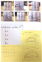
I decided to really simplify down the shapes to just a half circle and a vertical line. This way, I could focus on other aspects to make the type more interesting. I came up with my type that explores the motion between the half circles, propped up by the lines.
Finally, I thought that another way to incorporate motion would be to hover a water bottle over my type so that it distorts the letterforms. When I tried to do each individual letter, it didn't really work. It did, however, give me the idea to history the finalised typeface. I like the outcome, although I think that this may be more effective in terms of poster design or logotype.
I decided to take the advice I got in my crit and take it back to my 'Permanent Transit' typeface. This time, however, I was struggling with the 'mechanical' aspect of things, and so I looked up synonyms of the word. I discovered motion and I thought that this worked well in representing the exhibition alongside the word 'mechanical'. The idea of pushing artist forward and being a forward-thinking exhibition linked.
I decided to really simplify down the shapes to just a half circle and a vertical line. This way, I could focus on other aspects to make the type more interesting. I came up with my type that explores the motion between the half circles, propped up by the lines.
I developed my design in multiple ways digitally. However, I also had the idea to inject morion into it by creating curved versions physically. My plan was to then photograph this and trace it, expecting to have some really warped and exciting outcomes. This was not the case, as my paper curved tubes looked slightly pathetic. It did, however, give me the idea to create a varied line weight at the sides and thinner at the top. I was expecting this to be a really good outcome, however, I was once again disappointed by the result. To me, the final outcome looks very script-like.
Finally, I thought that another way to incorporate motion would be to hover a water bottle over my type so that it distorts the letterforms. When I tried to do each individual letter, it didn't really work. It did, however, give me the idea to history the finalised typeface. I like the outcome, although I think that this may be more effective in terms of poster design or logotype.


No comments:
Post a Comment