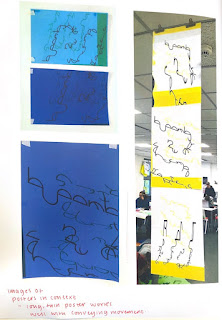
In preparation for my type specimen, I firstly continued to think about my logotype in context, as this will need to be included. I focused on process - layering and distorting using the scanner. For the first time, I also began to think about the paper stock that will be used for my printed elements - posters, type specimen, even the wristband. I think that using a green could be a strong possibility as this relates to motion in terms of traffic (GO! on a traffic light). At first, I wanted a neon green, I think this could fit the tone of voice for the contemporary exhibition. However, thinking this over I think that something more subtle could offset my typeface quite well. I need to go to Fred Aldous and pick out the perfect green paper for my specimen.
I really liked the outcome of the distorted logotype, however, I think for the sake of continuity it would be better to use the more structured version - and then perhaps experiment with distortion through a series of posters and how they relate to each other, much like the long poster shown.
I think that I should also experiment with other ideas of continuity through a poster series using other elements- perhaps my type stays stagnant and I crop images of the artwork and college them throughout the series - so show a sense of movement?
Type Specimen Development
My first idea for my type specimen was a long, thin, poster, of which the perspective was tilted to accommodate for my logotype which has been edited that way. My intention was for the poster to by longer than A0, but approximately A3 size in width. I wanted this length because I would be able to fit all the information that is needed for the specimen throughout the length of the poster, while still accommodating for negative space and appropriate layout.
I think that this idea was strong and fit my theme well, however, I was really struggling with the logistics of the layout. When it came to fitting all the elements on the page, I was having a hard time with conveying motion appropriately. I kept thinking to myself - I should make a booklet.
When I confirmed that I would make the change to a booklet - My first thought was about the shape. I think that it is really important that the shape of the pages still be angled. As well as this, I wanted it to be landscape rather than portrait, which conflicts with my ideas for the poster. I think that if the booklet is landscape it will accommodate for my lengthy typeface - I can also think about how I convey motion across the long pages. My main idea for the booklet that ties it to my theme is to have the all-important baseline running throughout. My rule will then be the same as it was for my typeface - information will either sit on top of or below the baseline.
Other ideas that came to mind when I was thinking about my booklet - I want to revise the animation idea that I had in when thinking about logotype of the full stop rolling down the letterforms then falling into place. One interesting thing could be to make a small flipbook and bind this into my specimen.
Crit
I had a crit session were people looked at my type specimen development. Feeback seemed to show that my booklet idea was a lot stronger and that the size and dimensions I had chosen were appropriate. Surprisingly, a lot of people said to not use my typeface for the body text but to choose a body text that relates to my theme. I need to look into this further and become certain about a body text to use. But for now, I would quite like to use Tw Cen MT as this is a geometric font that works well as body text.
What to do next
Looking forward I need to really develop my type specimen. To be able to do this, I need to firstly work on my logotype in context. I want to develop an image of the vinyl stuck on the outside of the building, an angular wristband, and a poster series.


No comments:
Post a Comment