Wednesday, 29 January 2020

Component Book Idea


Developing initial ideas for a new idea: 'component book'. I wanted to visually convey the fact that Bill Bryson learnt from textbooks that were written in the 1950's and 60's. I also wanted to interpret the word 'nearly' within the title in a different way - from this, I imagined a student or struggling scientist who failed to write an entire history of everything - and so scribbles it out and writes 'nearly everything' over the top of their notebook. I think that going forward if I want to develop this design, I may drop the 1950's imagery as the people at Penguin strongly suggested sticking to one simple theme. Maybe simplifying the design and focusing on visually communicating a notebook would be best. I like the idea of using the component book as a basis and then designing my own labels / spine etc. I could also have fun with the back cover by putting the actual text 'Component Book' above the bar-code to tie it in with the design. I think that sticking to one thing is a good plan, but focusing on just one fact from the really extensive book just doesn't seem to capture it all or feel appropriate. Therefore, focusing on a word from the title and communicating that feels better to me. 

I did, however, through my research find an absolutely amazing typeface called HK Gothic. I began researching 1950's fonts and came across Interstate - which is used for all of the road signs. Interstate was inspired by Highway Gothic - which led me to look at American Gothic fonts and I came across HK Gothic. I think that it's perfect for a classic component book design but still has character. 


In my crit someone mentioned using imagery that does not directly link to science so much but maybe reflects some of the things within the book, I definitely think that I should move away from the slightly patronising imagery that has been used - perhaps just communicating the notebook further with post-it notes and scrap paper? 
Someone also mentioned re-designing the logo to say 'your name here: Bill Bryson' and I think that could work really well. To develop this design I definitely want to design my own labels anyway to make it more personal and unique. 

Tuesday, 28 January 2020

Village Books


For my research I visited Village Books, an independent bookshop offering a range of contemporary art, fashion, design and photography books and magazines as well as self-published zines. I was interested to see some contemporary takes on book covers, as when I visited a more regular bookshop it was hard to find a decent amount of well designed covers. At Village, a lot of the covers I saw were abstract and mostly simply photography. I found a book called Sugar Paper Theories by Jack Latham that had an interesting diagram on the front - this reminded me of my own project and gave me an idea of a nice way to draw a science-y diagram The colours we're also very nicely chosen and complemented each other as well as the title well, whereas a lot of the books in WHSmith are monochrome and stick to all blue or yellow etc. Furthermore, David Shrigley's book Fully Coherent Plan hosts a lovely naive drawing / diagram that tajes on a more abstract approach. 


I also was surprised to see another cover inspired by vintage composition books: The Photographer's Playbook by Gregory Halpern and Jason Fulford. The cover is very simple in design, but takes on the same approach that I am trying to achieve. It shows me the main elements of what is needed for a cover in this style: the black spine, large label etc. 

Type Only Covers


I was really excited to make some type only covers. I had a lot of ideas going into based on kerning and visually communicating the meaning of the words within the title. I began experimenting by focusing on one font (Futura) and all the different weights and style. I wanted to start physically so that I could quickly map some of my ideas out and then do some more developed digital work. I made a couple of responses to the title that focused on the word 'Everything' - I scattered the letters in order to make the word take up the most space, visually communicating the meaning. I then developed this by weaving the sub title through the letters, trying to visually communicate space. I also focused on some of the more obvious decisions - cropping the word short, shortening the world nearly etc. - I think that this is effective but perhaps too patronising and expected. 


For my digital developments of my 'Everything' idea I think that I was too literal in re-creating my small collage that was too limited. I wish that I would have gone even further with the idea, pushing it to the extreme. I think that a design like this should either be very simple, or very over the top - with the word everything filling up the entire front cover and spilling over the edged. It could be a lot simpler and a lot more effective. I think if I maybe tried to do this physically on the scanner on a larger scale it could work better also. I was finding doing digital work quite slow and struggling with grids and how it worked with the spine and the back cover etc. - I definitely want to go back and rework this idea by being more extreme with it. 


My second idea that I managed to develop in the study task was the hand written text. I liked the idea of putting more emphasis on 'Nearly' by having the start of the title being typed out in a strong font, and then stopping halfway through 'Everything' and then 'Nearly Everything' scribbled over it. I like the witty-ness that the word nearly gives the title and how it reflects the author's style of writing - and it would be interesting to reflect that. Again, I should have gone further with this idea but I was finding digital work to be slow. I think that this idea goes hand in hand with another one that I had about hi-jacking a notebook and making it look like a student's science work book or scientists notebook. I think that I need to stop working digitally on ideas from the very beginning as it limits me to what I can get done on Photoshop / Illustrator. This design would be a lot better if brought together through multiple physical elements. 


People in my crit seemed to like the style of design that I had developed for the covers, but didn't seem to grasp the ideas behind them. There were some issues with the "Everything" design as someone didn't understand why the word had been scattered, saying "make it mean something". I think that my justification for the idea is valid, but that it should be pushed further in order to be more understandable. I could really enlarge the word so it takes up most of the space on the cover and spills out onto the spine, or try and connect the letters using atom imagery. Furthermore, with the scribbling out idea, I should definitely develop the notebook idea, and include the full word so as to make it clearer.  

Sunday, 26 January 2020

Contextual Research - WHSmith Bookshop

I decided to visit the WHSmith bookshop with the intention of finding some existing covers to analyse. It's actually very hard  to find decently designed covers as the majority of them out there are so bad. I picked out a couple of the books that stood out to me:


Richard Green's cover design for The Uninhabitable Earth by David Wallace-Wells perfectly captures this "story of the future. Such a strong and simple design is appropriate for a book as serious as this one. Personally, I love the power in the simplicity and how so little can say so much. The small bee image creates an instant connection to the title as well as recognition for the viewer. Granted, this cover is not witty, however, that wouldn't fit the tone of writing. It is clever, impactful, and appropriate. 


"A manifesto about the most dangerous form of information - the news." 
"A welcome source of calm and wisdom."
The idea here is clever but I think that it could have been executed in a much better way, or even just thought about differently to produce a better outcome. The use of the newspaper grid to layout the text is interesting and effective however I wouldn't have included the grid lines as this takes away some of the effect and also doesn't leave room for negative space. Also, all of the fonts that have been used are really poor choices, why not use an actual newspaper font or one reminiscent of one? The fonts that they have used stick out in a bad way and bring down the overall tone of the design - taking it from what could be a nice, clever, contemporary design to a gimmick. 

Thursday, 23 January 2020

Type Ideas


Throughout my development I have already generated some type-based ideas that I hope to utilise in the next study task. I think that the title “A short history of nearly everything” presents some great opportunities to play around and be experimental with kerning. I really want to stretch the words, manipulate kerning, collage, cut up etc. I am excited to focus on type and produce some really contemporary and abstract designs that focus on the design of the title primarily. 

Physical Collage in Book Covers

I am really intrigued by this style of book covers that have been built up physically using collage. It seems that if done well, like in the cover for George Orwell's 1984, it can be a really interesting way of visually communicating an idea. I think that this technique could have great links to the 'hole' idea that I have been developing, as I could rip or burn holes into paper and reveal something underneath - perhaps the title of the novel or imagery that links to the idea. I also was inspired by a previously discussed contemporary book cover that was built up from many scraps of a textbook. The overall finish was really effective and I thought that the idea would lend itself so well to collated science imagery. It seems that collage used in the way almost always reveals something underneath - I could try and break away from this tradition or utilise it for my own good.

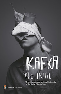
Kafta Covers


Personally I find these images by Jacob Sutton a lot more successful and appropriate for a book cover than Erwin Wurm's work. I enjoy the naivety and innocence of them. They evoke the same confusion and sense of questioning that Wurm's work does, but because they convey a strange sense of emotion - they are slightly more witty, to me. Someone also wrote about how the images resonate with Kafka's writing - something that I am desperate to emulate with Bill Bryson's ability to write about confusing subjects and make it easy to understand. 

Erwin Wurm - One Minute Sculptures


Erwin Wurm's photographs are intriguing and random - they evoke a sort of half 'smile in the mind' technique' in that they always involve a familiar: a person and a random object, and a play: the odd way in which they interact. These are only half 'smile in the mind' to me because a true witty graphic would produce recognition, surprise and so on. These images simply supply a slight shock factor - a sense of questioning and confusion. For photographic development, I will definitely be keeping in mind his style of simplistic visual communication. If given a purpose, a story, then images like these could be pushed a lot further. 

1 Minute Book Covers


The idea of one minute book covers is not to achieve brilliant execution or immaculate technique but to generate initial ideas of how to respond and what processes to use. From my research I had the idea of visually communicating the tone of writing in the novel, and how it is written in an easy to understand way. I wanted to convey this in a witty, 'smile of the mind' way by using a dunce cap to be the familiar element, and to change the writing to 'Bill Bryson' to be the play. It was then suggested, as this was group work, that we use some sort of scale and have the hat pointing to a point nearly at the end to visually communicate the 'nearly' in the title of the novel. Upon reflection I think that this is two ideas battling with each other and henceforth has produced a unsatisfactory outcome. I want to achieve a cover that is simple but effective, especially as one of the notes on the brief was to pick out one element and communicate it well. Here, i think that the two elements trying to come together results in the wittiness being lost. The 'smile in the mind' does not work because the prerogative of the familiar, the dunce cap, has been changed to relate to the scale, rather than just represent what it needs to represent. I think that this dunce hat idea could still be effective and work if done correctly - meaning that it should be it's own entity and more simplistic. The good thing that I gained from the development of this unsuccessful cover was ideas for the next study task which focuses on type-only covers. I quickly messed around with kerning and I know that I want to really exaggerate this in the next task. 


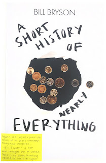
The next idea was to represent the quote "In perhaps the finest example in history of pouring money into a hole in the ground...". I think at first we definitely went too literal with this idea and produces some lack-lustre images that I have yet to try and develop into covers. We built an elaborate set up in order to get a clean shot of coins falling into a black hole but the outcome we wanted was difficult to capture with an iPhone camera. The effect of motion that the falling coins gave was slightly effective, and I want to start cropping and editing to see what I can do with them, however, I don't think that the quality in the images is really there. Due to this, I suggested that we interpret the hole in a different way by ripping one into a piece of paper and photographing it above the coins. I think this approach, though different to the first, is not as original or unique. I have to remember that these are 'one minute book covers' and so the execution is not great, but this idea just seems overdone. It got me questioning how I can push this 'hole' idea further - perhaps have the type be underneath the holes, only partly revealing the text? I think that something like this would be 100% more interesting.


Finally, there was the orange idea. This came from the quote "when you sit n a chair, you are not really sitting there." in relation to atoms stopping things from really coming into contact with each other, there is always a small gap. I really wanted to visually convey this idea in an abstract Eric Wurm style, with someone positioning themselves around a chair in strange ways, holding a chair in strange ways, or shouting / getting angry at a chair - just something really weird and abstract. However, it was suggested to us that we use random objects and communicate the space between them using paper. I do not like this outcome as I don't think it's interesting or visually pleasing. I am yet to develop these into book covers using the template, however, I don't feel great about the images themselves. We were told that their 'not weird enough' and I agree - they have no questioning or shock factor to them - they are just boring. 

Wednesday, 22 January 2020

Key Ideas From Research


  • Could use texture / pattern resembling climate / natural disasters - this could be used for science grids also 
  • Could look into the eccentric behaviours of the scientists that Bryson worked with - this could lead to a 'mad scientist' theme (smoke, chemicals, quirky photography etc.) 
  • Cover needs to be FUN to resemble the laid-back, witty approach to the writing as well as engage an audience that is NOT already interested in science 
  • Tone of writing has also been described as a "childlike determination" - definitely justification for illustration  
  • Focus on quotes from the book that state a fact then a witty anecdote or punch line - this gives interesting imagery to work with (i.e. sandwich quote) 
  • Idea for visually communicating the fact that the book is almost "science for dummies": illustration of a monkey reading a book OR incorporate a dunce hat. Dunce hat might not appeal to a younger audience though, whereas if monkey is drawn in contemporary style - could work.
  • Holes in science - could be nice to visually communicate physically by creating layers of collage, some with text for the cover and some with holes that cover up parts
  • Science textbook idea: could be really nice to gather a lot of vintage science imagery (photographs, books, notepaper, sketches, scales, diagrams etc.) and layer this up to create the cover. Cover copy can be written in appropriate typeface of hand written in order to incorporate it and can be layered into the collage 
  • Appropriate kerning for the title should definitely be explored 
  • If exploring witty ways of merging two images: use half tone to make it gritty and easier to work with 
  • could be nice to find science grids / diagrams / patterns and mess with these / break their rules

Practical Research: A Smile In The Mind


Written by Beryl McAlhone and David Stuart, A Smile In The Mind explores witty thinking in graphic design. The book makes the case for wit, seeing humour as the shortest distance between two people. The routes designers can take are examined in a section of different types of wit: ambiguity, missing links, substitution, and double takes. The novel then sees these theories in context: posters, packaging, etc.

The Dorothy Parkers of the visual world: purloining an existing phrase to say what they want to say. The message resides in the unexpected twist.


Jack Summerford's Helvetica in Garamond T-Shirt - a classic example of structural wit. The familiar idea is that Helvetica is the holy of holies for designers. The play is to portray the the standard-bearer of modernism using old-fashioned garamond. To be able to recognise wit in graphics, look for 'the play' on 'the familiar'. The familiar is often a well known phrase or proverb, a visual cliche, genre or graphic icon. The play is the acrobatic type of thinking - the somersault, a reversal, a side-ways jump, where the outcome is unexpected.

The familiar and the play are responsible for the two emotions felt when someone 'gets' the witty idea: recognition and surprise. These two elements together produce a matrix of success. If the design is low on the play and hence low on surprise, the solution will be too obvious and weak. If the design is low on the familiar and hence recognition, then it will be baffling, enigmatic, and impenetrable - prompting a feeling of failure. If the design is low on both - it is a complete fail.

This technique of recognition and surprise is so successful because it pleases people in numerous ways. First of all it wins over the viewers time. It intrigues, seduces into making a commitment. It is interactive, invites participation. Furthermore, it then gives the pleasure of decoding, and hence, a rewarding feeling, Next, amusement. Most wit prompts an explicit or implicit smile. Then, it gets under the guard - humour gives confidence and the right frame of mind towards an idea or product. Consequently this forms a bond through shared understanding. Finally, it leaves a trace - wit is memorable.


Ambiguity 


A form of two-in-one design that works like an optical illusion. The image is not half one idea, half another. Both ideas are complete and autonomous, and the mind flip-flops between the two. The artistry is in the synchronicity, as each detail in the design fits both readings.

One example of ambiguity in design is Noma Bar's book cover designs for two of Margaret Atwood's novels The Handmaid's Tale and The Testaments. In terms of the cover for The Testaments, Bar’s brief from the publisher was to create a contrasting image of the two sisters seen on the front and back covers, playing up to the fact that they are in wholly different situations, locations and circumstances. While the front cover bears a generic resemblance to his design for The Handmaid’s Tale cover, featuring the handmaids’ distinctive cloak and bonnet, the back cover depicts a girl that would be recognisable to most of us today, wearing earrings and her hair tied up.

Bar says: “The main thing I wanted to do was to show the parallel worlds and lives of the two girls by reflecting and mirroring the sisters,” says Bar. “We chose the design as a double cover as I wanted to highlight the two characters’ presence – it’s not about one sister, it’s about two worlds.”

Substitution 


One element playfully swapped with another. Success depends on introducing a rogue element that is visually similar but remote in meaning and relevant message. This fusion of two normally incompatible component produces the characteristic response to wit - recognition and surprise. For example, substitution has been used in Oliver Munday's cover design for The Assault by Henry Mulisch. The head reduced down to a simple shape, but all importantly still recognisable. The bike, flipped upside down and put in place of eyes - the witty surprise.  Even better, the design enforces the plot as the main character is assassinated as he rides home on his bicycle. 

Practical Research: Chip Kidd - "Designing books is no laughing matter. OK, it is."


Knof Design book publisher asks the question: What do the stories look like? Designing a cover is making the book look like something, giving it a face. This is to give the reader a first impression of what the book is about. 

A book designer gives form to content and also manages a very careful balance between the two. For example, showing a picture of an apple and writing the word apple is treating your audience like idiots. You either do one or the other. However, if you merge the two: the reader is forced to straddle two planes of existence and the book itself offers interaction, exploration, touch.

A book designer's responsibility is to the reader, to the publisher and to the author. 

A book cover is a distillation, a haiku of the story. Once the book designer has read the book they then must be an interpreter and a translator. 

Do your job right and get a little lucky: great art can be great business. 

Monday, 20 January 2020

Contextual Research - The Marber Grid


Romek Marber was a well-trained Polish designer working in London. He had done two covers for Penguin when the new art director Germano Facetti invited him and two other Penguin illustrators, John Sewell and Derk Birdsall, to propose a design grid for the crime imprint. Marber won. His approach was very methodical, reflecting his interest in symmetry and proportion:
To retain the unity of the series, the freedom of where to place the title, the logotype and price and in what colour, is controlled by the grid, and routine readers of crime fiction will be able to pinpoint without difficulty the title and author’s name. (Romek Marber)
Marber based his development of the grid on the Golden Section, the ancient formula for well-proportioned designs, especially in architecture. Since the A-format paperback is made in the Golden Section proportions (1 : 1.618) it was a logical starting point.

Contextual Research - Oliver Munday


Oliver Munday is an incredibly talented book cover designer from New York. When I look at his designs, I see a mixture of contemporary ideas and a strange sense of familiarity. Munday seems to be able to make his designs feel like instant classics. In his cover for Draw Your Weapons by by Sarah Sentille, for example, Munday manages to visually convey themes within the book whilst making reference to the title, whilst being clever. He says in an interview - "I design book covers by trade, and titles are important. They’re often the first clue to the text. It’s astonishing how quickly imagery suggests itself. A designer’s mind has the ability to construct entire visual narratives from just a few words." The reference to titles are evident in his work - as his image making almost always seems to give a subtle nod to the tile. His humorous wit manages to shine through his designs that are simply well made and put together. His choice of imagery is appropriate and concise, his type always relevant with a hint of nostalgia. 

Contextual Research - Contemporary Cover Design


Looking at a lot of different book cover designs from a range of sources, it's clear to see the trends and patterns within contemporary book cover design. These tend to be incredibly abstract especially when it comes to type - most designers make type the main focus of the design or decide to scrap it completely and use image to visually communicate the book instead. One way or the other, there are a lot of covers that stick to just type or image. For the cover of 'Hopscotch' for example - imagery is not necessary as the clever idea is conveyed only through type. 

Furthermore, negative space is utilised well within contemporary design as it is often used to draw focus on to important elements of the design. Once again, pushing this theme of abstraction, the negative space seen in a lot of designs allows for a simplified cover that focuses on one element of the book. 

Colour is also important in contemporary design and it seem that when appealing to a younger audience, bright colours are used to grab the attention of readers. It has been proven that young children respond better to bright, primary colours so perhaps this is being utilised in contemporary design also? A good example of using bright, contrasting colours is 'It's Freezing in LA!' - where purple and green is incorporated into a beautiful, natural texture. The colours create a contrast that is both eye-catching and engaging. 

Book Covers I Like 


I work in a small bookshop and often look through the shelves to find my favourite covers. When thinking about contemporary book cover design I pictured the bookshop and tried to pick out which ones stood out the most to me. Immediately two came to mind - Outliers by Malcolm Gladwell and American Psycho by Bret Ellis. Although very different, I like both covers for very similar reasons. Gladwell's Outliers focuses on the best and the brightest, the most famous and the most successful. He asks the question: what makes high-achievers different? This is brilliantly conveyed through the simplistic gold star on the cover - just a small nod to the content that finishes it off perfectly. The typeface and hierarchy paired with the comfortable negative space also suits the informative yet relaxed tone of writing. Furthermore, the cover design for American Psycho does a very similar thing in a different context. Instead of simply communicating all the best people on the Earth, the designer hints at Patrick Bateman's psychotic tenancies with just a smudge of blood. The book is described as incredibly controlled, careful, and important and this is all here on the cover. Less is truly more.      


Contextual Research - Penguin Books

Bethany Rush - Murakami's Norwegian Wood


My redesign of Murakami's Norwegian Wood focuses on the characters’ desire for understanding pain through letter writing.  I looked to create something that reflects both the author's story and the way in which he writes it. By creating a detailed and sympathetic response to the brief, I wanted to create the same sense of symbolic possibility Murakami uses to construct his narrative. Each stamp is a representation of the main characters and I have appropriated the traditional Japanese style using the symbols, metaphors and allegories that have been weaved throughout the book.
I love the way in which Rush has visually communicated multiple aspects of the novel from the content, to the motif's, to the author's story all through one idea. She has been really sensitive in her approach and even connected the type to the author - having it cascading down the page rather than across. She has shown great attention detail - there are three stamps on the cover which could have just been a design choice, however, each stamp actually represents a character. I think that this shows great consideration to the novel and the readers who would appreciate these thoughtful elements. By focusing on an envelope she has given herself a grid to work with which makes working with the elements on the page easier as well as making her idea instantly readable. To develop her design further I think that she could have either tried to break the grid that she made for herself or push it to it's limits. She did not carry the envelope theme onto the back cover of the design and I think that was a missed opportunity. The back cover almost looks rushed - there is no thought or continuation of the the theme there.

Kate Garnet - Oranges Are Not The Only Fruit


"It took a good two weeks of whittling down three or four rough notions to my final idea. ‘Orange Is Not The Only Fruit’ by Jeanette Winterson tells the story of a woman who spends most of the book trying to come to terms with the strict, religious environment in which she has been raised. My cover uses the Bible to symbolise this narrative. Once I had decided on the direction to take, it took another two weeks to get the look just right."
I enjoy Garnet's cover because of the creative, strong idea behind it as well as the execution. She took a simple themes from the book, coming to terms with religion, and visually communicated it perfectly in one manipulated image. Thus, creating a cover that is both graphic and illustrative in it's imagery and type. I do wish, however, that Garnet would have incorporated the elements in the bottom left white square within the design. Just in some way, so that it didn't stand out so starkly from the strong design. I also think that the typeface used for the title should have been revised. In relation to the rest of the design, especially the author's name, it does not read well. It's almost as though it floats on top of the cover with no relation or meaning to the text at all. 

Madalyn Farley - To Kill A Mockingbird
“The left hand is significant in To Kill a Mockingbird as a key symbol of innocence, whereas the open palm suggests vulnerability – two key themes of the story that inspired me.
“I included the small bird-foot detailing in the creases of the hand to subtly reference the title without using the obvious mockingbird imagery. The writing in the creases of the hand refers to fate and is my way of linking the title to the story. The bold contrast in colours refers to racial divisions in 1930s America, another core theme in the book that inspired me to create this cover.”
The thing that I like best about Farley's cover for To Kill A Mockingbird is the bright yellow that has been used to contrast with the black, Although no justification has been mentioned in her rationale, I think that it probably links to some research into existing covers and what grabs buyers attention - as the colour is eye-catching and captivating. Furthermore, the hand imagery is a good choice of symbolism as it is carried out throughout the novel, and the contrast in colour further communicates the racial issues discussed within the book. To me, the typeface used represents the young protagonist of the novel, even though this was not mentioned in the rationale. 

Contextual Research - Previous Covers

Previous Covers 


The current cover for Bryson's novel does not encapsulate how iconic it is. The book is a decade old and a best seller, popular amongst many readers, yet this cover does not communicate that. Instead, it makes a cheap attempt at conveying the light tone of the writing by using bright, un-earthly colours as well as a 'fun', abhorrent font. Bryson himself as well as many who have read the book say that it is for everyone of all ages who wants to learn. So, why does the cover only appeal to an older audience? It does not display contemporary design with little to no negative space. There has been no hierarchy used in terms of type and the imagery is expected and boring. Penguin has mentioned that as there is so much content covered in the book (nearly everything), that it would be best to find one simple concept and stick to it. That has not been done in this cover design. The attempt at trying to encapsulate all elements within the book results in a cover that makes very little sense - which is ironic as it adorns a book filled with knowledge. 


This cover experiments slightly with hierarchy by making the author's name larger in an attempt to grab buyer's attention - as Bryson was already an established author at the time of publication. Similar to the current book cover due to the expected Earth imagery - this design is slightly more imaginative in it's 'manual' imagery. A slightly different and unique idea, if only design principles such as negative space had been pushed further the design would have been a lot more successful. I think that if it were more contemporary in style, the idea would have been more effective, however, the designer has been knocked back bu the limitations of type and colour. The design also presents the question - why is that cling film texture there? What is the relevance? If more stripped back, this design could be successful in visually communicating the fun tone of the book. 


This existing version of the novel is my favourite, however, still not up to the standards of some good contemporary book covers. An attempt at 'A Smile in the Mind' design has been made with the clever asterisk design and this also introduces some nice hierarchy - once again making the author's name prominent in attempt to grab buyer's attention. Unfortunately, the Earth imagery is abused once again but has been used in a more sophisticated way. I personally enjoy how the colours are contrasting and almost look as though they have been picked out from the image of the earth. However, I do not think that this cover would appeal to a younger teen audience as it does give off a sense of science textbook due to the negative space - if, perhaps, used differently, then it could have been more successful. 


This previous cover makes an attempt at ingenuity, however, the lack of creativity when it comes to the imagery lets it down horribly. The common theme amongst the majority of the past covers is the Earth - and although this cover has interpreted it in a different way to the others, it still lacks creative flare as well as style. The issue is again with trying to encapsulate the entire novel in one image - it produces a boring, predictable cover that does a better job at visually communicating the title rather than the what is actually inside the book. Possibly the most contemporary of all the covers, it does utilise object manipulation, however, is still lacking in contemporary design. 

Conceptual Research - Reviews


Module Evaluation

This module has been really positive for me. I'm so glad that I chose the issue that I did, because I felt passionate and motivated the ...