Monday, 25 May 2020

Module Evaluation

I definitely believe that my biggest strength within this module was my research. I learnt so much new information that really impacted my design work, such as the exploration of Reid Miles as well as contemporary designers like Jay Vaz and Hassan Rahim. Arguably, the inspiration from those modern day designers have been a bigger help in allowing me to modernise my own design style and feel a lot more confident as a contemporary designer. This extensive level of research that I conducted has also led me to realise that I am heavily biased towards conceptual design, although having now realised this, I am not surprised. Additionally, I feel that my confidence with image treatment has skyrocketed and I now know that I can produce something simple and it can still be good design. This module has helped me not only realise but also elevate my skills within Photoshop as I created gradient maps and GIFs. I am also proud in my ability to bring together multiple concepts seamlessly to create something new - exemplified by my Cab Calloway hand signal illustrations. 


Despite this, my biggest weakness has definitely been time management and motivation. Having not been in a creative student community and having my friends around me, I have struggled to keep up my passion for creating work. This is something that I am really eager to improve on, as I know that if I do I can create so much more for myself and projects outside of uni. It has made me reflect and realise that I rely heavily on motivation and praise from others to get work done, whereas I should be more focused on motivating myself. Furthermore, whilst being at home I have not reached away from my laptop to make work - which I find shocking. Within other modules I have really enjoyed being hands on and physically making things, however, even though I have limited resources at home - it was definitely still a possibility. 


Since this was the last module of the year, I certainly approached it with more confidence than the first few. I now know the order of business: get your research done quickly, generate ideas as fast as possible, use different processes etc. and I think this allowed me to generate some quality work at the start of the project while I was still really motivated. Also, I understand the utter importance of quality research. Having learnt from past mistakes - if your research is bad, your design will be. This idea has to be good. These are all things that I have learnt that unknowingly have made me approach a brief differently.


Having felt confined to my laptop whilst being at home, in the future I will definitely try to keep away from it in order to create outcomes. I think that digital design is good, however, having reflected on my own work it has made me realise the significance of creating something physical to generate work and the impact it has on designs. This could be anything such as creating sculpture, crumpling paper, modifying objects, or using models.I think that nothing beats taking something physical and photographing it or scanning it in numerous ways to generate designs. 


The stage of designing that I find the hardest would have to be experimenting with initial ideas. Sometimes I feel like this makes me a ‘bad designer’ but I tend to get really anxious about whether the work that I produce will be good enough, and usually wonder if I am wasting my time on a ‘bad idea’. I know that to get over this I need to realise that bad ideas are there for a reason and help push the development of a project, however I still tend to pressurise myself to make all of my work my best work (and get frustrated when it’s not). In contrast, once I have a solid idea that I know is good, I tend to find running with it really easy. Once I like an idea I could generate designs forever as long as I don’t have to think about how to justify it anymore. This however, tends to make me search for approval often as I want someone to tell me which idea to choose. To combat this, I really need to learn how to trust myself and answer my own queries. 


I know for sure that I need to improve on type. I really didn’t enjoy the type module and think this has left me with some unjustifiable disdain for type but I struggle so much s that for this module I didn't even try - and I really regret that. I understand that it is a skill that every designer should at least try and have a go at - so I am going to make it my personal mission to give it a go in my second year, if not before. Reviewing my own final outcome for this project I know that it could have been improved by a custom typeface, so this is a skill that I really want to be at least moderate at.


Finally, I really regret not being able to physically produce the final outcome for this module. I already know that I would have had so much fun producing a poster zine as well as a sticker sheet - as these are things I now know how to make thanks to previous modules. Despite this, being in lock down has really improved my mockup skills.


Final Outcomes


Poster Zine


I really wanted to include a posterzine within my vinyl package because I wanted to show the photographs off in full. They are so important to the research and the idea behind the design, yet in the sleeve design are very abstracted and blurred. 

Here, in the posterzine, the photographs can be seen in full along with their accompanying illustrations - making the link between the sleeve, the vinyl label, and the sticker sheet make sense. 

Initially, the idea was to have the black and yellow side be the zine layout, and the back - the flag design, to be the poster. However, I am so pleased with the design that I think both sides would be good enough. 

Poster Zine pages and sticker sheet


Vinyl Sticker Development


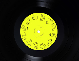
My initial plan for the vinyl stickers was to come up with an alternative version of the cover design with added type, however, I decided to utilise my research and do something different. I wanted to incorporate the research that I did into Cab Calloway and the Fliescher Brothers, and so I began to illustrate the Jazz hand signals in the style of KoKo the Clown, the character that portrays Calloway. 

I was really happy with the outcomes, as I think that they add a type of comic relief to the existing vinyl cover design, and change up the tone to be less serious. I think that this is positive, as it is similar to how the Techno influences soften the seriousness of the Jazz - both musically and socially. 

I was really pleased to have been able to implement my phenakistascope  research, although the design does not work at the same frame rate as a real phenakistascope. If I had had the time, I would have liked to have developed the vinyl stickers in more detail so that they actually work successfully. 

Final Sleeve Design


Flag Experiments


- I felt that the cover design were such a good visual identity for the genre of Nu Jazz, that I wanted the flag to tie in with them - so used the same technique of collaging. I wanted this version, however, to be completely centred around the environment of a Jazz bar or a Techno club - and so kept to the use of my own photography of the Domino. This creates flashes of an environment and bright, lurid colours. 

Development


-Collage inspired by Hassan Rahim successfully communicates Jazz and Techno in a well balanced way using imagery and image treatment. The photography of Jazz hand movements as well as the Jazz club mixed with bright, lurid colours and heavy bitmapping and cropping create a new identity for Nu Jazz. 
-Experimented with adding motion blur to the type to take this point even further, however, this is cheesy. 

Thursday, 7 May 2020

Development


I wanted to try the previous technique that I have developed numerous times to generate a lot of differing outcomes. It involves a lot of duplicating, layer blend mode-ing and cropping to achieve a sporadic, spontaneous composition much like the improvised music.

Here. I realised that I really like creating a collage and then cropping down into it. It may end up that I create one large collage for the final outcome, crop into it, and this almost wraps around the cover.

I experimented more with Blue Note type here, however, I think that this particular typeface, Carendon, which was used for many Blue Note covers is really dated whereas Franklin Gothic resembles the sans serif typefaces that are so popular within techno posters, events, covers etc. today.

Wednesday, 6 May 2020

Experimenting with Type


For my first experimentation with type, I began by referencing Blue Note covers and their distinct use of type. Thankfully, on FontsInUse.com, I was able to identify a wide range of fonts used by BlueNote, which meant that I could directly use the same fonts in my own experiments. 

I wanted to choose something that would also reference the distinct repeated type that Hassan Rahim used for his work for Jaques Greene. I really like the use of the typeface (Franklin Gothic Outlined) within my own work because it references back to both Reid Miles' designs as well as modern techno visuals, especially when repeated. 

I also experimented with the idea of having the type on a plastic sleeve that could be removed to reveal the collage by itself. I like this idea and the subtlety within it because it links to both of the tracks having no lyrics, they are atmospheric and I feel like a cover with no type reflects that.


Tuesday, 5 May 2020

Image Development


Felling inspired by Hassan Rahim, I began working with my images differently. Looking at my outcomes, I can tell that this is a very early stage and no where near the final outcome. However, I like the direction that this is going in. 

I struggle with colour, and prefer to work in black and white. However, I need to push my self out of this comfort zone - so I tried to channel bright, colourful, 90's techno in the first few outcomes. I realised, however, that I had forgotten to bitmap my image - and I really wanted that texture to be a part of the design. I ended up duplicating the images and then layer blend mode-ing the bitmapped version on top, which produced some really funky outcomes. I was absolutely amazed by what this process had done to the bottom left image, and as I wasn't very font of the composition anyway, cropped into it. Although this is far from a final outcome, I find it interesting to see the difference between the first image and the last and the improvements. I am going to simply keep playing around with more images, compositions and colour to see what comes of it. 

Hassan Rahim


Looking at Hassan Rahim's work for Jaques Greene's 'Feel Infinite', I am really inspired by his visuals. I think that his way of blocking together images and creating compositions is really communicative of the techno genre - the repetition of images and type along with the bright colours. I think this is a great example of the kind of image treatment I want to achieve. I talked about layers in previous post - I think that if my images were communicating jazz, then the colours could communicate techno very much like they do here. 

Rahim also wrote a whole twitter thread about the production of the design, and it was really interesting to see what inspired him. Apparently, it was really important to capture where the artist was from, as well as his family and friends. So, this is what Rahim took abstract photos of and then 'formally abstracted' even further using Photoshop. I think that this is a really good way of getting across a full sense of environment. I could, bring back some of my photos that I took at the Jazz club and use them in a similar way to visually communicate a Jazz environment.

One thing that I am most inspired by is the way that Rahim has created this visual identity for the whole album that spans much further than the cover design itself. The visuals are in use for the singles, posters, the booklet within the album, and even music videos. This has definitely given me an idea of how to create a visual identity that can cover the entire vinyl as well as the flag, and how they can work together. 

Module Evaluation

This module has been really positive for me. I'm so glad that I chose the issue that I did, because I felt passionate and motivated the ...